Google Docs and Google Sheets have proven to be a great alternative to Microsoft’s Word and Excel apps. Although they’re free to use, there are many features that are missing compared to Microsoft’s tools.
Regardless, most users find both of these Google apps functional enough to take care of their daily tasks. One such task is adding charts and graphs to your text documents. Unfortunately, you can’t create graphs directly in Google Docs, but rather you’ll have to use Google Sheets for that.
Why Use Google Sheets to Insert the Graph
Although graphs may appear to be static, they’re actually quite dynamic. You only have to input the data and tell the app which to use to generate the graph.
As mentioned previously, this is the territory of Google Sheets. Just enter your data in a spreadsheet, select the data, and insert a graph.
How to Create a Graph in Google Docs on a PC, Mac, or Chromebook
Creating a Graph or Chart

Adding graphs and charts to your Google Docs is pretty simple on your computer. The steps involve opening your Google Doc and a Google Sheets document then combining them.
- Open the Google Docs file that you want to add a graph to, click File > New > Spreadsheet, a new Google Sheets file will open.

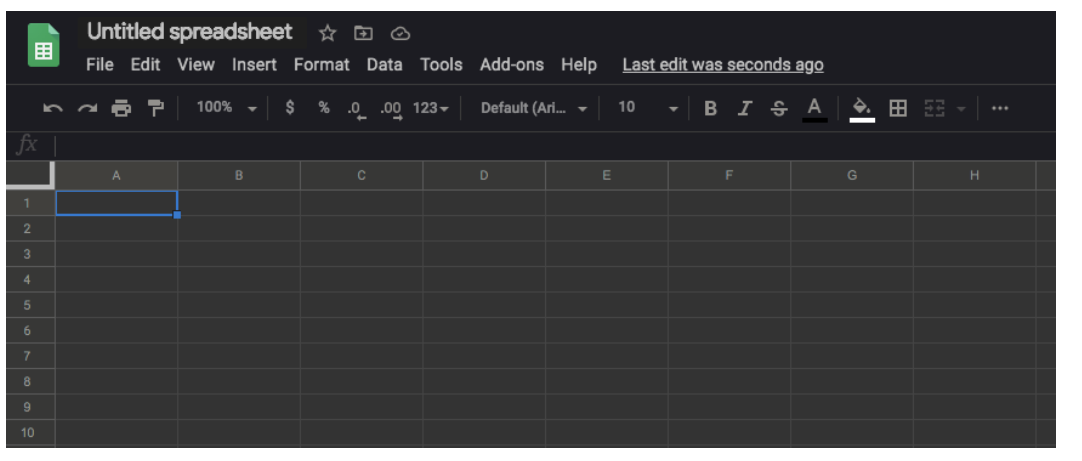
- A new page will appear in Google Sheets, fill the cells with the data that you’d like to convert to a graph.
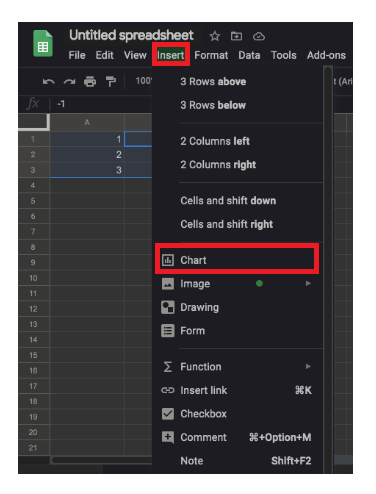
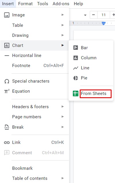
- Select the cells containing your data and click on Insert > Chart.
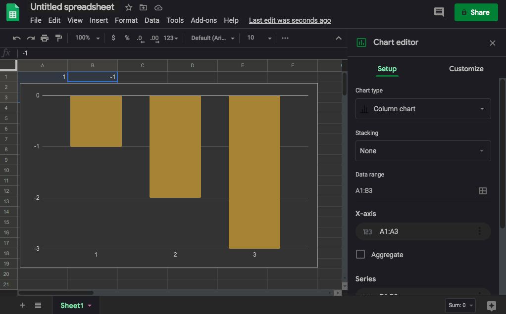
- Now, the chart should automatically appear in your spreadsheet.

Copy Your Chart
You can also use your keyboard commands to copy the data.
- macOS users can input CMD + C, Windows users can use CTRL + C.
- You can also head back to your Google Doc by clicking on Insert > Chart. The bottom of the menu has a From Sheets option. Tap that and your most recent Graph will appear (just be sure to give it a name in Google Sheets so it’s easily identifiable).

Paste Your Graph (Optional)
- Return to the Google Docs file and right-click where you want to place the graph. Use your keyboard shortcuts to paste your chart into your Google doc. macOS should use CMD + V while Windows users can click CTRL + V.
- Now, a Paste chart menu will appear with two options: Link to spreadsheet and Paste unlinked. You can either keep the link to the spreadsheet or paste the graph without linking it to the data. If you think you might have to change the data points on the graph, you want to keep the link.
- When you’re done, click Paste and the graph will appear in your Google Docs file.

You’ll be able to use the graph to reopen the spreadsheet that contains the data and play with it. You can add, remove, or simply change some of the figures and have everything automatically updated on your graph.
Modifying the Chart Type
To modify the chart type for a graph that you’ve previously placed in Google Docs, you have to open the graph in Google Sheets first. Start by opening the Google Doc containing the graph that you want to modify.
- Click on the graph so that it becomes highlighted.
- Next, click the link icon.
- Now, click Open source.
- Then, open the editor and wait for the Google Sheets file to open. When it does, click the graph that you want to modify. You can double-click the chart or click the three vertical lines in the upper right-hand corner of the chart to open the editor.
- Click the Setup tab and then click the Chart type drop-down menu located just under the Setup tab. Now, choose the chart type that suits your data the best.
- Click Update in Google Docs.


As long as you’ve opted to link the chart with your Google Doc you will see an ‘Update’ tab. Click that and your chart will update with the edits you’ve made.
How to Make a Line Graph
- By default, Google Sheets will select the most appropriate chart type for your data. If you want to change it to a line graph, follow steps 1 to 10 from above.
- Next, scroll down to the Line section of the drop-down menu and choose the most suitable line chart. Besides the standard Line chart, you can also use the Smooth line chart to smooth out the line, rather than connecting each data point.
How to Make a Bar Graph
- Like the previous two sections, repeat the same steps to get to the Chart type drop-down menu. Now, scroll down to the Bar section and choose one of the three available options: Bar chart, Stacked bar chart, 100% stacked bar chart.
A bar chart is similar to a column chart but with the time and amount axis reversed. The time figures are now on the x-axis and the amounts on the y-axis. A stacked bar chart combines all categories into one bar, with each category represented by its own color.
Similar to the stacked bar chart, the 100% stacked bar chart also combines categories into one bar, save that the graph now shows each category’s share in the total.
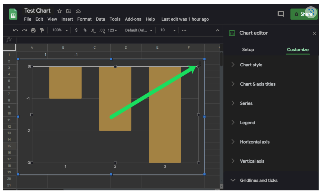
Editing the Legend
- To alter the graph’s legend, first, follow steps 1 to 8 under Modifying the Chart Type.
- Once you open the Chart editor menu, click the Customize tab and scroll down to the Legend section.
- When you click its drop-down menu, you’ll see a couple of options. Position lets you place the legend above, below, left, right, or even inside the graph. You can also choose to remove the legend by selecting None.
- Next, you can choose the font type, size, color, to bold, and/or italicize the description.
How to Create a Graph in Google Docs on an iPhone or Android
Creating a Graph or Chart
Adding a chart to your Google Docs file on a smartphone is slightly different than doing it on your computer. Although you can use the Google Sheets mobile app to create a chart, you can’t add it to your document with the Google Docs app. Instead, you have to open your Google Docs file in a browser and then add the chart that you’ve previously created in Google Sheets.
Before you begin, make sure to first install both apps on your smartphone. For Android users, visit the Google Play store: Google Docs, Google Sheets. For iPhone and iPad users, visit Apple’s App Store: Google Docs, Google Sheets.
The first step is to create a chart that you want to include in your Google Docs file.
- Open the Google Sheets app.
- Add the chart data to your spreadsheet.
- Select all the cells that contain the chart data.
- Tap the + icon in the app’s top menu.
- Now, tap Chart.
- The app automatically creates a chart for you. If you wish, you can change the available parameters. When you’re done, tap the checkmark icon in the top left corner to save your chart.


Now it’s time to import that chart to your Google Docs file.
- Create a document using the Google Docs mobile app.
- When you’re ready, open your preferred browser and go to google.com.
- You should be on the Google Docs main page. Since it loads in the mobile view by default, there will be a couple of options missing. That’s why you want to open it in desktop view.
- Tap the browser’s menu button and look for the option Desktop site, Show desktop version, or similar. Check the box next to it and the page will automatically reload in the full desktop version. Note that if your browser doesn’t have the desktop view option, you can always use Google Chrome to complete this action. It’s available for both Android and iOS.
- Tap anywhere on your document where you’d like to insert your chart.
- Tap the Insert tab from the top menu.
- Then, tap Chart.
- Next, tap From Sheets.
- A pop-up window will appear and list all your Google Sheets files that contain charts. Tap the one containing the chart you want to insert and then tap the Select button in the lower-left corner of the pop-up.
- Tap the Import button in the lower-right corner of the pop-up.
- Finally, the chart appears in your Google Docs file.


Modifying the Chart Type
- To modify the chart type, you also have to use the Google Sheets app.
- Open the Google Sheets app on our smartphone.
- You’ll see a list of your spreadsheets, tap the appropriate spreadsheet.
- When the spreadsheet opens, find the chart that you want to modify and tap it.
- Tap the chart once more for the options menu.
- Tap Edit chart > Type and then choose the desired chart type.


When you’re done, tap the checkmark in the top-left corner of the screen. The updated version of the chart will appear in your spreadsheet.
Now, you can open your Google Docs file to inspect the updated chart.
How to Make a Line Graph
- Just follow steps 1 to 6 of the previous section.
- When you get to the list of available charts, choose one of the three available line charts.
- When you’re done, tap the checkmark in the top-left corner of the screen and that’s it.
How to Make a Bar Graph
This process is the same as the previous two examples, except that you’d choose the preferred bar graph.
Editing the Legend
- The Google Sheets mobile app allows you only to change the position of the legend relative to the graph. To do so, follow steps 1 to 5 under Modifying the Chart Type and tap Legend on the menu.
- Now, choose one of the options and tap the checkmark in the top-left corner of the screen.
Additional FAQDevice Links
Device Links
Do I have to use Google Sheets in order to create a graph in Google Docs?
Yes, the only way to enter the data for your graph is through Google Sheets. Although you can create a graph directly in Google Docs, the graph data will be generic. As such, to edit the data, you’ll have to open the graph’s source, which is a Google Sheets file.
Can I change the default chart type?
Unfortunately, it’s not possible to change the default chart type since there isn’t one. Google Sheets automatically determine which chart type to apply based on the applicable data.
When do I use each chart type?
A line chart is good for observing the flow of your data over a stretch of time. It’s also great for comparing different values, understanding the distribution of your data, and identifying data trends.
Column charts have almost the same use as line charts. The only difference is that columns clearly show the size of each data point.
Bar graphs are identical to column charts, only that they show the data horizontally. This layout is more convenient when the labels contain a lot of text. Another great use for bar graphs is to show negative values, as the graph doesn’t take up a lot of vertical space on the page.
Pie charts find uses in showing the composition of the individual parts of a whole, especially in percentages. For example, if you want to display the share of each browser type used by your website visitors.
Enjoying Your Graphs
Now that you know how to add dynamic graphs to your Google Docs files, you can customize their type, layout, and visual appearance. Not all that different from Excel, Google’s tool once again proves it’s a viable option for most users.
Have you managed to add a graph to your Google Doc? Which graph type do you use the most? Please share your experiences in the comments section below.
Disclaimer: Some pages on this site may include an affiliate link. This does not effect our editorial in any way.