It may seem like the internet is just a mass of trolling and abuse at the moment but there are plenty of delights littered across the web to distract you from the state of the world, or simply help you avoid your work and studies.
Over the coming months, we’re going to be sharing our favourite sites from those that leave us in awe to those which give us some light relief from the daily grind. If you have any recommendations of your favourite ways to pass the time online, let us know on Twitter or Facebook.
The Year You Were Born
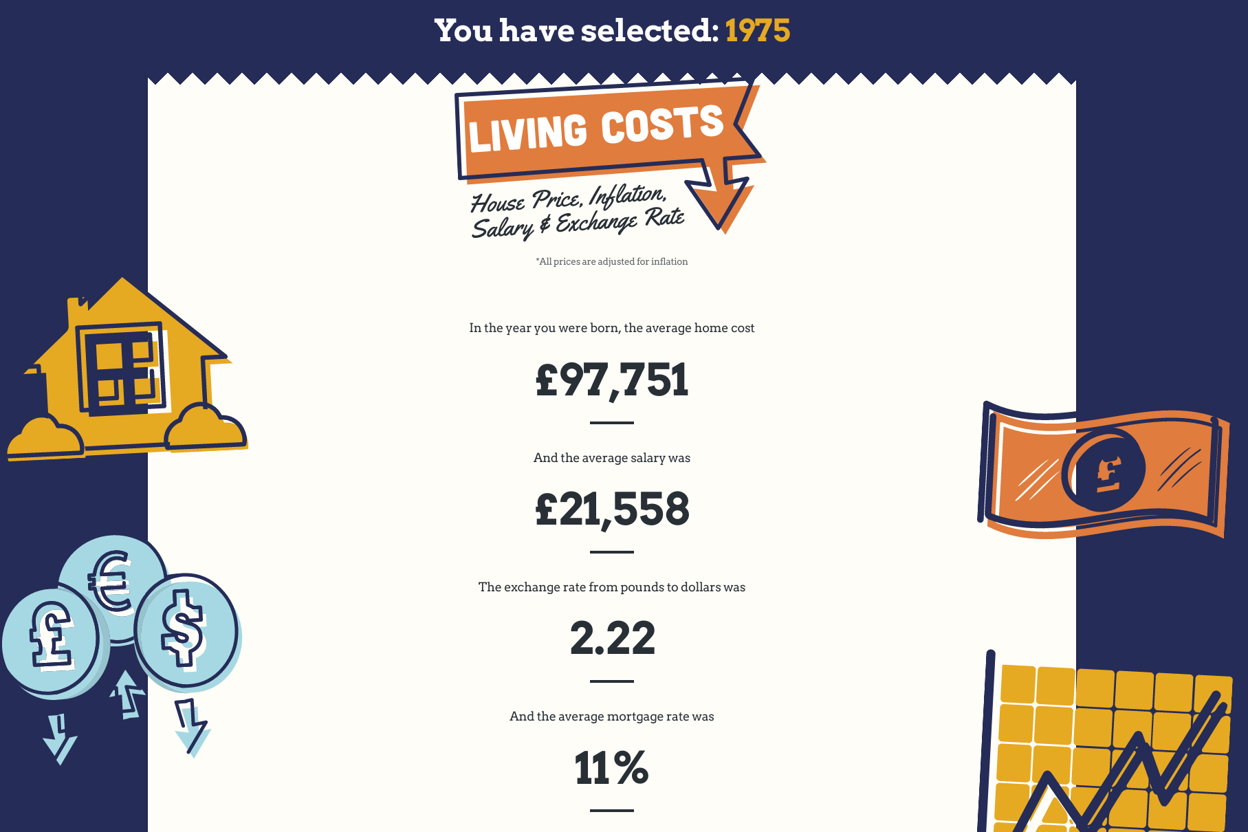
The Year You Were Born tool from interior-design company Hillary reveals how living costs have changed in recent decades. It lets you look at any year from the last century and adjusts the figure based on inflation.
Its figures include the cost of a car and fuel; house prices and mortgage rate; salary details and the cost of a weekly shop. Flick the ‘Compare to today’ switch to see if a specific outgoing is cheaper or dearer today.
Time Traveler: Discover the dates of words

Time Traveler is a fascinating new tool from dictionary publisher Merriam-Webster which stretches back to before the 12th century and tells you when specific words were first used in print. Results can be shared on Facebook or Twitter and you can click any word for a definition. “Whoo-hoo!” as they wouldn’t have said prior to 1981.
Project Apollo Archive
Scroll through the images in the carousel below by hovering over the image and clicking the arrows.
This treasure trove of photos was uploaded to Flickr in 2015 and the Project Apollo Archive collection has been growing ever since. At the time of writing, the archive features more than 14,220 images taken during the height of the Apollo space program.
During this program, astronauts conducted experiments, piloted spacecraft, and of course, walked on the moon, capturing every moment with a modified Hasselblad camera. In addition to the traditional TV and small-film cameras on board, the near-distance stereoscopic shots of the moon and majority of images in the archive were taken on three Hasselblad 500ELs.
The archive covers the first manned test flight in 1968 of Apollo 7 through to the final mission in 1972, Apollo 17, the final lunar mission in 1972. You can read more about the history of photography during the Apollo missions here.
How It’s Made…The GIF version
This webpage is beautiful in its simplicity and is overwhelmingly mesmerising. It is simply a page full of GIFs showing how various everyday items are made from springs to Pop-Tarts and highlighters.
The 25 Biggest Turning Points in History
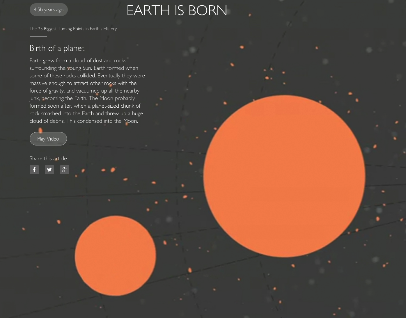
The BBC has a fantastic interactive design department that regularly produces stunning, thought-provoking sites. One of our favourites is The 25 Biggest Turning Points in History.
From Earth being ‘born’, you can scroll down to see the beginning of plate tectonics and the first mass extinction. The site additionally features a timeline that shows when the events took place.
As the site explains: “Our planet has existed for 4.5 billion years, and it has been a busy few eons.”
Worldometers
This website draws data from the United Nations Popular Division, the World Health Organisation (WHO) and the World Bank to show various world statistics rising in front of your eyes.
Data points include the current world population, births this year, births today, deaths this year, and deaths today. It also shows emissions, government expenditure, water usage and many more.
The data manifests as a list of erratically flickering numbers, from the fiendish accumulation of solar energy striking Earth today (the numbers roll round like a fruit machine), to the altogether more languid build-up of deaths caused by smoking (the counter increases by one every five or so seconds.)
What Powers the World

This fascinating map gives a glimpse at which countries still rely heavily on fossil fuels and which are blazing a trail with renewables. Flicking the switches on the map show the regions that would be plunged into darkness if fossil fuels ran out tomorrow, while hovering over a country reveals the energy split for that particular location.
The UK, for example, gets 64% of its power from fossil fuels, 20% from nuclear and 16% from renewables including solar and wind. Germany’s split is similar, but it has more of a reliance on renewables (59% from fossil fuels, 15% from nuclear and 26% from renewables.)
Image: Frits Ahlefeldt
Disclaimer: Some pages on this site may include an affiliate link. This does not effect our editorial in any way.