
We’re not getting any younger. Literally. Between 1985 and 2010, the number of people in the UK who were 65 and older increased by 20% to 10.3 million according to the Office for National Statistics. The percentage of under-16s fell.
The Fight for Sight organisation estimates that a third of people over 65 have “difficulties with their eyesight”, while the RNIB puts the number of people who start to lose their sight in the UK at 100 every day.
The 180-Day WebSight Pledge
PC Pro has joined forces with Royal National Institute of Blind People (RNIB) to encourage companies to get their websites and apps to a minimum standard. Click here for all the details, and to take the pledge.
I myself was recently diagnosed as suffering from wet macular degeneration, making me just one of half a million people in the UK with the eyesight-warping condition, for which there’s no cure. Combine the ageing but IT-savvy population with the statistical chance of visual impairment, and the consequences of the way in which websites and apps are coded start to become apparent. A visual impairment doesn’t necessarily mean total blindness, and limited vision presents a different set of problems when using IT than those facing a totally blind person. Yet all too often, as long as an application can be accessed by screen-reader software, the developer will consider it to be an “access-for-all” job well done.
By ignoring the requirements of low-vision users, developers are effectively shutting out large numbers of people and, as already stated, that number is sadly growing all the time. Low vision isn’t a problem that will go away if you ignore it, but as a developer you can make a difference to the lives of those of us who are cursed by it and increase your potential userbase at the same time.
Looking through my eyes
Before you make any well-intentioned usability changes to your website or app, make sure you talk to people with low vision, as well as the organisations that represent them – and don’t forget to test the results with the same usability groups before rolling them out. Get to know what using an average application or visiting an average website might be like for someone with low vision. Although simulators exist, most are designed to show difficulties for people with colour blindness. For some great examples of what someone with various other ailments sees, click here and here.

These will give you a feel for the degree of difficulty people might have in viewing your work, and provide greater understanding of how to make it more accessible. Also try your hand at completing the various navigational tasks to be found at the WebAIM Low Vision Simulation – a representation of how users with macular degeneration can be frustrated by poorly designed web content.
Once you’ve got your head around the user perspective, it’s time to apply the five Cs to your website, apps and software: colour, contrast, configurability, consistency and control.
Colour & contrast
 One of the big problems facing low-vision users is a poor ability to distinguish between certain colours. Although it’s easy to think of colour contrasts that will be all but impossible for any low-vision user to read, such as black text on a grey background, other problematic combinations are more surprising: black text against a white background can be, as someone accurately described it to me recently, “like looking at ants on a lightbulb”.
 The trouble is that everyone has a different optimum contrast combination (yellow text on a blue background does it for me), so user configurability is the key here. That said, there are best-practice tips you can follow to make life easier for low-vision users: increase the contrast between the text and the background; consider adding support for at least two high-contrast settings (light on dark, and dark on light); and always use solid-colour, not patterned backgrounds, when overlaying text.
The World Wide Web Consortium (W3C) accessibility guidelines also remind web developers that their pages shouldn’t rely on colour alone to convey functional meaning in their website designs. Here’s why: a low-vision user will often use a combination of custom colours with magnification, and, when looking at only a small section of the screen, contextual design clues to navigation are lost. This is compounded on websites where colour changes are used as a distinction between main content and navigation areas.
Configurability
Configurability is king for the low-vision user, so when designing your application or website strive to ensure that pretty much every aspect of content presentation is user-configurable. That means letting the user make text bigger or smaller, change the colour of that text along with the background colour it sits upon, and making the overall layout (in the case of a web page) relative rather than absolute, so it can be widened or narrowed without excessive horizontal scrolling.
Complying with the DDA
Since May 2002, the Disability Discrimination Act has required all service providers take “reasonable steps” to change a practice that makes it “unreasonably difficult” for disabled people to make use of its services. That includes people with visual impairments, and probably means that many websites and software applications have been in breach of the law ever since.
Quite apart from the legal requirements, or the moral satisfaction of doing the right thing, there’s a commercial reality to consider: by alienating low-vision users you’re losing business, be it in terms of eyes on pages or software licences sold. When Tesco launched an access-friendly version of its shopping site a decade ago, it secured £13 million of new business in a year. It’s since gone on to roll the accessibility options into the main website, with a low-vision option that simplifies layout and disables JavaScript, for example.
We’re not talking about technical accessibility, but real-world usability for people with low vision. This is about giving users the choice to experience your content in the way that’s best for them. It isn’t about exchanging your visual design concept for a boring, text-only step back into the 1990s.
Web designers can adopt a simple rule of thumb: make sure the site is readable and usable (these aren’t necessarily the same thing), both when text is enlarged and pages are zoomed (once again, these aren’t necessarily the same thing). By ensuring that non-text content scales properly, employing relative font sizing, and testing it to ensure the layout doesn’t break when the user increases the font, you should have a website that’s accessible to all.
Columns can be problematic for low-vision users who are magnifying the screen and losing the visual context of the website design. Usability studies have shown that users employing screen magnification software often fail to move far enough to the right of the screen to encounter columns of text located in that area. A single-column layout is certainly preferable under such circumstances, but many developers will feel uneasy about what appears to be a retrograde step in terms of web design. The solution is as simple as it is obvious: use stylesheets to provide a low-vision-friendly, single-column option at the click of a button on the homepage.
All developers should carefully consider how text is presented. A number of low-vision usability tests have shown that sans serif type is easier to read than serif. The good news is that research reveals the same is true for people with normal vision, so opting for a sans serif font is a no-brainer. Just because users with low vision will most likely be employing a screen magnifier, doesn’t mean you can’t make things easier for them by ensuring larger font sizes are available before they apply that magnification. Enlargement using a tool of some kind comes at a cost in terms of performance and quality, both of which can be minimised if that larger font is available to begin with.
Legible text resizing should also apply to going smaller as well as bigger, by which I mean that some low-vision conditions, such as those causing tunnel vision, may require users to fit as much text as possible onscreen to be able to see it. When considering the configurability of text, don’t forget to include menus and tables as well as information dialogs and prompts. Finally, never present your text as an image, for so many reasons: high magnification renders it illegible due to pixellation; browser zooming has no effect on text presented this way; colour and contrast settings can’t be customised, and so on.
Configurability touches on many more aspects of usable design than straightforward text and colour issues. Make all timed events adjustable by the user, since those with low vision will take longer to read, and therefore react to, information that’s only briefly displayed onscreen. If you’re using a CAPTCHA system for user authentication, then bear in mind the additional problems these can cause low-vision users. Even people with good eyesight have been known to have difficulty distinguishing the text from the background patterns, so make sure you provide an audio alternative such as reCAPTCHA for low-vision users, or implement a different verification process.
Neither should you ignore audio prompts. A limited field of view, either caused by the visual condition itself or as a result of magnification levels, can mean that it’s very easy to lose context, because there’s relatively little information visible at any one time. Audio cues alongside visual prompts regarding state changes, or the availability of new information, go a long way to solving this problem, and give control back to the low-vision user. Talking of limited fields of view, the relatively small effective screen size being employed by a user of screen-magnification software means that you should thoroughly test your application or site to ensure there are no problems with usability caused by layout issues when the window is zoomed in this fashion.
Consistency
Consistency is an oft-overlooked piece of the low-vision design. When you can’t see an entire page in context at the same time, it’s almost impossible to navigate a website if dialog, menu and button positions move from one screen to the next. Keeping the basic navigational design consistent not only helps low-vision users, but makes things simple for everyone else as well.
Consistency also applies to your use of colour and contrast, and your implementation of configurability options. There’s no point having a highly configurable homepage on your website if as soon as the user starts drilling down through the site they discover those options have been removed. Remember that many of the access aids used by low-vision users require the location of the keyboard focus to work properly, so make sure you consistently expose this focus indicator across your application so that the assistive technology software can “see” it. Include a highlight or focus indicator when dragging the mouse cursor, even at those times when the cursor is invisible. This adjustment will help screen enlargement software using “pan and zoom” features to track the user’s movements more accurately.
Control
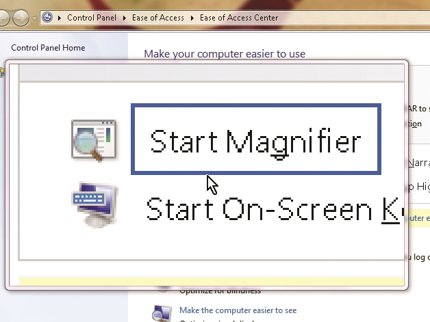
If there was one word that sums up good low-vision development practice it would be control; user control, that is. The single most important aspect of the UI from the low-vision user perspective is the ability to control certain aspects of it, rather than have everything imposed upon them through a rigid and static design process. A good example is the use of magnification tools. I regularly use the screen magnifier tool within Windows 7, for example, to allow me to quickly enlarge images and certain text elements onscreen. However, if the developer has opted to use an image of text then all that magnification does is increases the pixellation and make it even more unreadable.
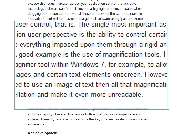
Think dynamic rather than static, allow the user to zoom images and text, change colours to get the best contrast and so on. Low-vision users will typically use the operating system, the web browser client and third-party screen-magnification software to varying degrees. But there’s no magic design bullet that dictates the best background colour, optimal font or screen layout that will suit the majority of users. The simple truth is that low vision impacts every sufferer differently, and customisation is the key to a successful low-vision user experience.
App development
Smartphones can be particularly vexing for low-vision users, as I have discovered myself. You can only pinch and zoom text so far on an iPhone before it becomes unreadable. With many apps, I have found myself resorting to a handheld illuminated magnifier to see onscreen information clearly. Far better for app developers to incorporate low-vision awareness into their apps at the design stage.
There are detailed instructions within the Apple iOS Human Interface Guidelines that explain how to create intuitive interfaces for disabled users, and the Apple Accessibility APIs define how iOS apps can make their user interface available to external assistive apps. Supporting these APIs enables apps to be compatible with the VoiceOver screen-reader function, which interacts with objects in the app to allow alternative gesture or voice control. Low-vision users can also benefit from the white-on-black display mode options. Finally, Xcode enables accessibility labels and information to be added without fuss to standard controls: use the Interface Builder “inspector” to enter descriptions for UI controls that are supported by VoiceOver.
Android isn’t left behind by Apple in the low-vision stakes either, with an accessibility layer providing text-to-speech. The TalkBack screen reader comes preinstalled on many Android devices, so make sure your app supports it.
Disclaimer: Some pages on this site may include an affiliate link. This does not effect our editorial in any way.