Everyone has it. Food that languishes at the back of the cupboard for years because you can’t be bothered to throw it out. A jar of some gooseberry jam from 2008; the redcurrant jelly you bought for Christmas dinner six years ago; or even a can of beans from 2010. Office for Mac had been feeling past its sell-by date, too: last updated in 2011, it’s been steadily going mouldy ever since.
Until now, that is. Office for Mac 2016 is finally available to the public, arriving a full three years after the last update on the PC, and five years after the last Mac-based release.
Even then, only subscribers to Office 365 can get access to this latest version. If you prefer a perpetual licence to a yearly or monthly charge, you’re going to have to wait until September before you can buy the suite outright. Microsoft hasn’t revealed how much this will cost either.
It’s an embarrassing state of affairs, to say the least, and for many the update will arrive too late. By now, many Mac devotees – at least those with a choice in the matter – will have abandoned Microsoft’s ageing office suite in favour of modern, cheaper alternatives. Now iWork is free and Google Docs so much more powerful than it used to be, there are plenty of capable alternatives.
What’s new in Office for Mac 2016?
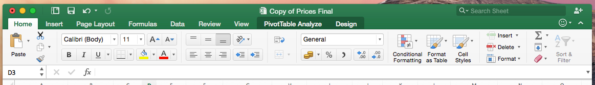
Essentially, Office 2016 brings the Mac version up to the same level as the Windows release, both in terms of the user interface and features. So, you’re getting a redesigned ribbon toolbar that looks far cleaner and which makes it a little easier to find what you’re looking for.
I’ve never been a big fan of the ribbon in the Windows version. You still have to do far too much hunting around for features you know exist but can’t locate – and on the Mac, there’s still the issue that it looks a little out of place. But I’m certain that I’ll get used to it over time; there’s absolutely no doubt that it’s a huge improvement on the old version.

Critically, Microsoft’s office suite no longer looks like it fell out of the 1980s, with full support for Retina screens and a look that’s consistent across all the key applications. With Office 2016, OS X users finally have a modern office suite that looks the part.
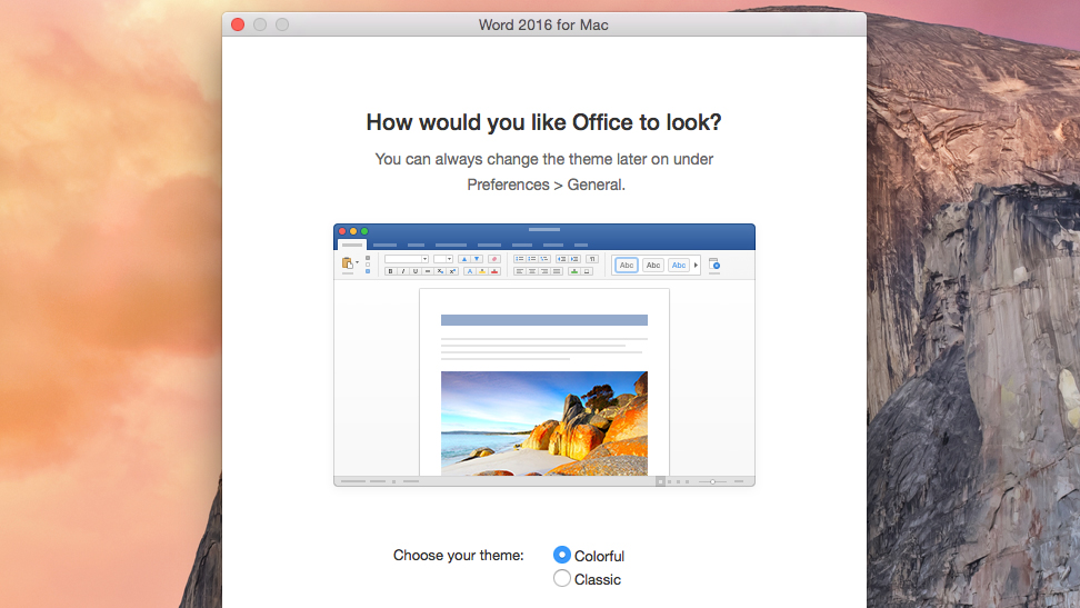
More specifically, the apps have a brighter look overall than before. If you choose the “colorful” option during setup, the area above the ribbon toolbar in each app will match each application’s signature colour: green for Excel, dark blue for Word, red for PowerPoint, light blue for Outlook and purple for OneNote.
But despite that, there’s a pleasing sense of minimalism at work here. The ribbon, as well as being reorganised, takes up less space than before, and the menus have a flatter, more modern appearance. And now that the icons are less packed together and have been redesigned, everything looks less cluttered than before.
Multitouch and OneDrive support
Office 2016 for Mac is about more than just looks, however. There’s improved support for multitouch touchpad gestures, for instance: you can now pinch to zoom in to documents, presentations and spreadsheets – to focus in on a detail or to get an overview – and scrolling and zooming animations are smoother as well.
On that front, at least, Office for 2016 is superior to the Windows version. In fact, Windows as a whole has never quite got to grips with seamless, responsive touchpad gestures in the way that OS X has.
And there are some other, small differences between Office on the Mac that contribute to a superior overall experience to the Windows version. The main one is that the confusingly muddled File menu, dubbed Backstage by Microsoft – in which the entire application window is hijacked by the Save, Open, Print preview and Settings menus – is not in evidence here.
For me, that’s a good thing. Backstage has always felt jarring, in the way it rides roughshod over OS paradigms established following years of careful development. Why should Office have a completely different way of opening and saving files to every other application on the platform? It may be the future, but it isn’t one that I’m particularly fond of.
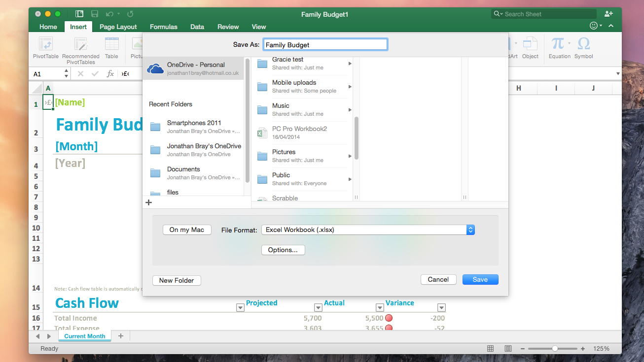
Here, thankfully, files are opened and saved using a much simpler dialog box. In my opinion it feels much less befuddling, and it manages to integrate Microsoft’s cloud storage system, OneDrive, at least as well as Backstage does. It could do with a search box, though – and, disappointingly, there’s no third-party cloud integration as yet. So no Dropbox or Google Drive.
The big question is, for those who have moved away to other offerings, is there enough in the latest version to justify subscribing? The answer is that it depends on your outlook (if you’ll pardon the pun). There’s no doubt that Office 2016 for Mac is a huge improvement. It looks more attractive, it’s easier to use than before and has more features than ever before.
But if you’re not interested in the latest UI gewgaws and a handful of features that may or may not be of use, then you’re better off sticking to what you have. Google Docs most certainly does the collaboration bit better, while iWork covers most basic needs perfectly adequately.
Word for Mac 2016 review
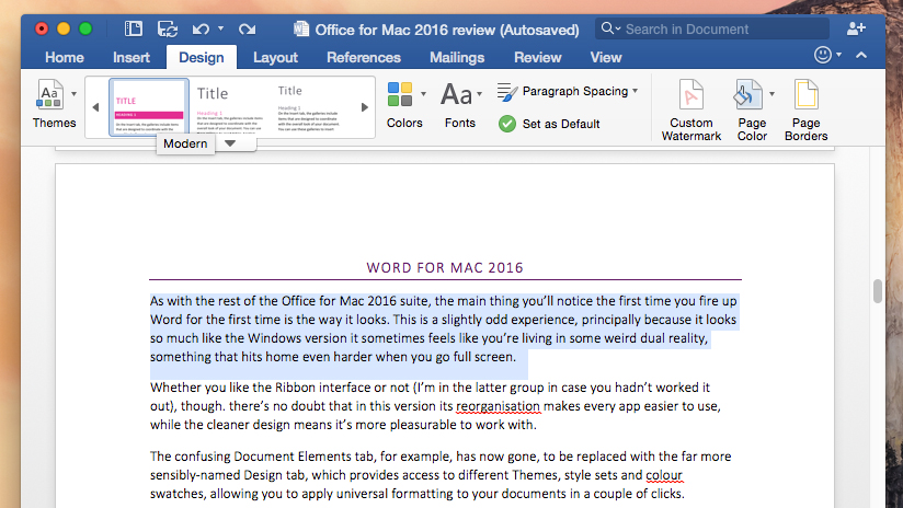
As with the rest of the Office for Mac 2016 suite, the main thing you’ll notice the first time you fire up Word for the first time is the way it looks. This is a slightly odd experience, principally because it looks so much like the Windows version it sometimes feels like you’re living in some weird dual reality, something that hits home even harder when you go full screen.
Whether you like the Ribbon interface or not (I’m in the latter group in case you hadn’t worked it out), though, there’s no doubt that in this version its reorganisation makes every app easier to use, while the cleaner design means it’s more pleasurable to work with.
The confusing Document Elements tab, for example, has now gone, to be replaced with the far more sensibly named Design tab, which provides access to different Themes, style sets and colour swatches, allowing you to apply universal formatting to your documents in a couple of clicks.
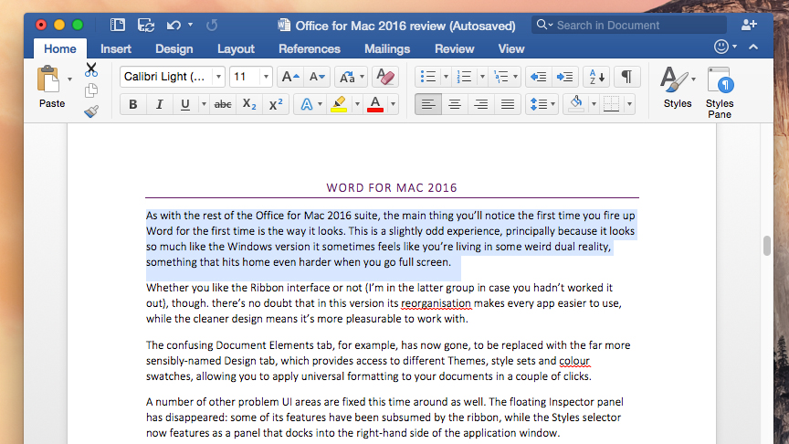
A number of other problem UI areas are fixed this time around as well. The floating Inspector panel has disappeared: some of its features have been subsumed by the ribbon, while the Styles selector now features as a panel that docks into the right-hand side of the application window.
Microsoft has also redesigned the Navigation pane, which now docks into the left side of the application window – another subtle yet welcome improvement. Accessed via the View ribbon, this provides navigation via page thumbnails, a collapsible style tree, a summary of comments and is also where the find and replace resides.
(Not quite) live collaboration
An equally major development is that Word 2016 for Mac has now picked up the facility for multiple users to collaborate on a single document. They can now add and edit away to their heart’s content, no matter where they are or what device they’re working on, be that an iPad, an iPhone or (gasp) even a Windows laptop.
Before you get too excited (I know, it’s only Office, but still), this isn’t live collaboration like you get with Google Drive documents, where you can see in real time others typing into your shared documents, deleting your precious words and making crude jokes at your expense; it can’t even match Microsoft’s own OneNote application on that front.

It is, however, better than nothing and works well as far as it goes. As you edit, dotted lines bracket the left side of paragraphs you’re working on to mark out that they’re different from the original document, and each time you save you’re notified if others have commented or changed anything.
Just as in Google Docs, you can reply to comments inline, and see who has made changes, as well as when they made them. When multiple edits are made to the same sentence of a paragraph, Word flags these up for someone to fix later, and if anyone becomes a nuisance, they can be blocked by the originator of the document.
Different strokes
Despite the almost identical looks, Word for Mac doesn’t quite copy the Windows version, feature for feature. Some of the icons look different, a change that is largely for the better. For example, the Track changes on/off button on the Review tab of the Ribbon toolbar takes the form of a toggle on the Mac version; far easier to understand than the rather cryptic button on the Windows version.
The real-time Style preview feature doesn’t make it over, either. On Windows, as you hover your mouse over one of the Style sets in the Ribbon, the text changes automatically. On OS X, you have to actively click the style, making it trickier to preview a style change, but easier to avoid having your text style change by accident, merely by nudging the mouse over it.
Elsewhere, there’s no sign of any Word specific apps, a feature Microsoft was very keen to push in the Windows version. The touchscreen-specific features of Office 2013 for Windows are also missing. For the most part, these differences are completely understandable. The Office app store never really took off in a big way, and since no Mac has a touchscreen, it’s unsurprising that there’s no need for a view that provides slightly larger, more finger-friendly icons. I do find it slightly odd that there’s no Reading view: although designed for touch operation, it did provide a distraction-free view that many users appreciated.
Verdict
Despite this, Word does feel like a huge improvement. It’s more attractive to look at, easier to use and boasts a handful of useful new features. Once you’ve started using it you most certainly won’t want to go back.
The trickier question to answer is whether you need to use Word any more. It used to be the first piece of software you bought for any machine, be that a Mac or PC, but those times have changed. On the one hand it remains the best solution for anyone needing to work with large, complicated documents, and retain complex formatting across platforms. Lawyers, editors and writers of technical documents and manuals need look no further.
For everyone else, however, the benefits of the new Word are largely skin deep. If you’ve discovered you can get along with Pages, or Googe Docs (or a combination of both), since 2011, there’s nothing here that changes that.
PowerPoint for Mac 2016
I have had a love/hate relationship with PowerPoint for as long as I can remember. On one hand, there’s nothing more powerful for creating presentations; whatever you need to do, PowerPoint will do it for you. On the other hand, it has always been a pain to do anything creative with. Compare it with Apple’s Keynote and you can see immediately that PowerPoint needs a ground-up reworking.
This release – PowerPoint 2016 for Mac – isn’t that ground-up rewrite. Instead, Microsoft has done the next-best thing and rationalised the interface, moving features around and making the product significantly easier to get around. All the power features are still there, but now they aren’t buried in complex layers of interface.
Easy does it
As with all the new Office 2016 apps, the revamped interface of PowerPoint 2016 for Mac has a lot in common with that of its Windows cousin. To my mind, this is a massive improvement over previous versions of PowerPoint. The tabs Microsoft has chosen actually make sense from a user-experience perspective, making the product much quicker to get your head around if you’re coming at it completely fresh.
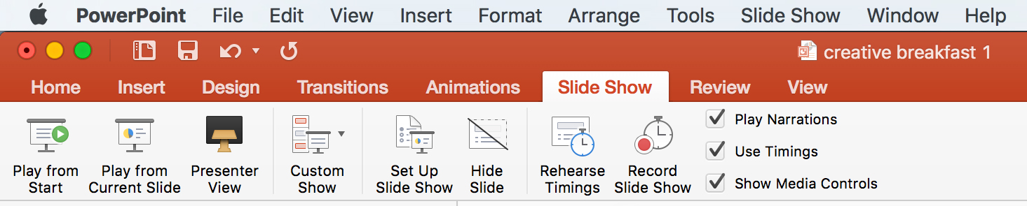
The toolbars have been rationalised into something approaching a useable state. Compared to the previous version, it’s much clearer. The tabs on the ribbon are sensibly named: Insert, Design, Transitions, Animations, Slide show, Review and View are self-explanatory; you know what you’re going to find under each one.
Of course, this means users of the previous version will find some of their favourites have been shuffled around. Tables, Smart Art and Charts now live under the Insert tab, and Themes has been incorporated into the Design tab. The new View tab allows you to manage your views without using the menu or the status bar.
New features
The big, new feature is a pane that appears on the right of the screen when you apply an animation to an element on a slide. This shows you all the available options for the animation.
Although there are no new features available for animation, having all of them at your disposal in one place, rather than split between the Animations ribbon and the floating Inspector palette, makes them much easier to use. You can now tweak and fiddle with animation settings to your heart’s content, which will mean better-quality animation from those who know what they’re doing (and more appalling whizzy-shiny things from those who don’t).
There are a few other little features that add up to a rounded update. A handful of new themes and transitions help novice users spice things up a bit, but my favourite change concerns the cleaned-up Presenter view, for use when presenting from a laptop to a second screen or projector.

This has always been good, but previously it looked like something designed in the 1990s that had been forgotten about. Not only does the new version look better, but it also has a single, small feature worth the update alone: a button for switching displays. Given the number of times I’ve scrabbled around wasting time as I hunt for a way to swap displays after connecting my MacBook Pro to a projector, it’s a great time-saver.
Verdict
The big question surrounding PowerPoint, however, has to be whether it’s better than Keynote. To my mind, the answer is yes. There’s nothing Keynote has that PowerPoint doesn’t, and the improved interface means its best features are no longer buried under 27 layers of menu, sub-menu, tab and inspector sheet.
Of course, you also get all the features now common to most of the rest of the Office apps, such as semi-live collaboration and better integration with OneDrive.
Overall, I think Microsoft has achieved its goals for PowerPoint and delivered a well-thought-out refreshed product, as powerful as before but easier to use. If you’re on an Office 365 subscription, there’s no reason not to update today.
Excel for Mac 2016
Love it or hate it, there’s nothing quite like Excel for managing lists, handling large quantities of figures, generating graphs and analysing trends. I’ve used it for years for building feature tables and graphs for comparative group tests in magazine reviews, calculating printer costs and heat-mapping wireless router performance.
Over the years, I’ve appreciated how hard Microsoft has worked to come up with new, genuinely useful features to add in each update of this now-venerable application. I used to think Excel was sufficiently powerful, but features such as conditional formatting, sparklines and slicers have proved me wrong over the years. None of these are what you might term “killer” features, but their gradual accretion has turned Excel into a must-have product for many people, including me.
What’s new?
Excel for Mac 2016 follows this long-established trend: despite its long gestation, it has few landmark features. The obvious changes are a new look and a reorganisation of the ribbon toolbar, both of which are indubitably good things. Working in an environment where the tools you need are easier to find is good for productivity, but it’s no Eureka moment.
The same goes for the seemingly frivolous cell and highlight-selection animations: although they don’t add anything meaningful to the Excel toolkit, the way the cell highlighter moves smoothly between cells makes the application feel more modern without breaking what’s already there. There will always be people resistant to such changes, but I think they add a polish to Excel that wasn’t there before, and that makes me happy.
I’m less convinced by Microsoft’s attempt at providing shortcut keys for Windows users, however. As in Word, the Ctrl+C/V/X/Z key combinations now work in the same way as Cmd+C/V/X/Z have always done. At first, this might seem to be a good idea, but it’s sure to cause further confusion down the line as users switch between Microsoft apps and others that don’t recognise Windows-style shortcuts.
It’s made worse by the fact that, across the Office for Mac 2016 apps, Windows shortcuts are applied without any consistency. For example, in Excel, it’s possible to hit Ctrl+Home to go to the top-left cell in a spreadsheet and Ctrl+End to go to the bottom right, but these combinations don’t work in Word, and none of the shortcuts seem to work in PowerPoint.
Still, in general, Excel is more pleasant to use than it was before, and Microsoft’s other tweaks make much more sense. Full support for Retina displays means even the smallest text on the fiddliest spreadsheets is now readable. Multitouch touchpad support is arguably even more useful than that: being able to pinch-zoom and two-fingered swipe to pan around large spreadsheets is fantastically powerful. If only it worked this well in the Windows version.
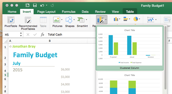
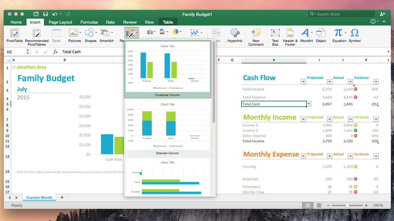
Although many of the rest of Excel for Mac’s new features simply bring the application into line with Excel 2013, there’s still plenty to get your teeth into. Microsoft’s Recommended Charts tool takes the guesswork out of generating graphs from vast sprawls of data – although the Mac version lacks the pop-up selector tool of the Windows edition.
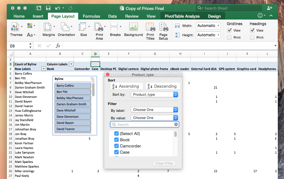
Pivot tables – a potent tool used for summarising large swathes of data containing duplicate values (think sales figures) – also gains a Recommended tool. Located on the Page Layout tab, this gives users a quick way to generate a suitable pivot table with a single click, instead of having to guess which field to drag where in the builder.
Pivot tables have also gained slicers – buttons that let you apply filters with a single click – and there are a number of other small features that may or may not make your life easier: Excel for Mac now supports most of the functions supported by the Windows version; OS X users can now install the Analysis Toolpak add-in (a set of data analysis tools for statisticians); and there’s a new equation editor and formula builder.
Not so good
As with Word for Mac 2016, however, there are some features missing. There’s no Power View, for instance, nor Pivot Charts or Power Query, all tools Windows users have been using since 2013. The Quick Analysis tool introduced in Excel 2013 doesn’t make the cut, either.
And, although Mac users get OneDrive integration – allowing spreadsheets to be saved to the cloud and accessed seamlessly across Windows PCs, tablets and smartphones – the collaborative elements of Excel’s “improved sharing” features are singularly disappointing and inconsistent with the rest of the suite.
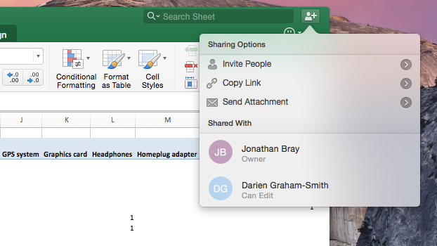
While it’s incredibly easy to set up a shared spreadsheet (just click the icon in the top-right corner of the application window and issue an invitation via email or generate a shareable link), only one person can work on a spreadsheet at a time.
This means, believe it or not, that you have to close down your file if you want someone else to be able to edit it without having to create a copy. Come on, Microsoft: surely you can do better than this.
Verdict
Despite the niggles, Excel for Mac 2016 represents a genuine step forward, with new tools for power users and ease-of-use improvements for everyone else. And, just like Word is great for big documents, Excel remains the best option out there for managing large spreadesheets with many thousands of rows.
It’s just a shame Microsoft still hasn’t quite brought the application up to parity with the Windows version in terms of features. There may be reasons behind the omissions, but it still feels a bit mean, given how long it has been since Excel for Mac was last updated.
Still, for most people who use Excel on a regular basis, this upgrade provides a welcome change.
OneNote for Mac 2016
OneNote is a new addition to Office for Mac 2016 suite. It didn’t exist on the Mac platform in 2011, and remained a Windows-only product until March 2014, when Microsoft made it available for free on the Mac App Store.
Indeed, you don’t even need an Office 365 subscription to use it, nor install the rest of the apps from the suite. Simply download the software, register for a Microsoft account if you don’t have one, and you instantly have 15GB of OneDrive storage space for your notes and any other files you want to attach to them.
OneNote vs Evernote
OneNote for Mac 2016 isn’t much different from that original version – aside from the new look and the ability to OCR notes uploaded to OneDrive – but that doesn’t mean it’s any less valuable as part of the wider Office suite.
As it is on the Windows platform, OneNote for Mac is designed for the creation, collation, and sharing of notes in all their wide variety of forms. Its most obvious competitor is Evernote, which, like OneNote, is cross-platform and takes full advantage of cloud synchronisation to give you access to your notes from anywhere.
Both applications use the metaphor of notebooks to store your information. However, that is where the similarity ends. In Evernote, the only forms of categorisation are notebooks and tags. OneNote uses the much more “real world” metaphor of tabbed dividers to split up notes, and allows you to group those tabs and create notes with sub-notes within them. For anyone used to paper notebooks, files and folders, this makes OneNote a much more natural fit, but it also puts the onus firmly on you to keep your notes organised.
There’s no limit on how many notes you can upload per month, as there is with Evernote. And, if you have an Office 365 subscription, you can forget about limits entirely: Office 365 now comes with unlimited storage, for whatever you want, including OneNote. (Note, though, you’ll need to opt-in for the unlimited storage upgrade – it’s not bestowed on your account automatically.)
Take note
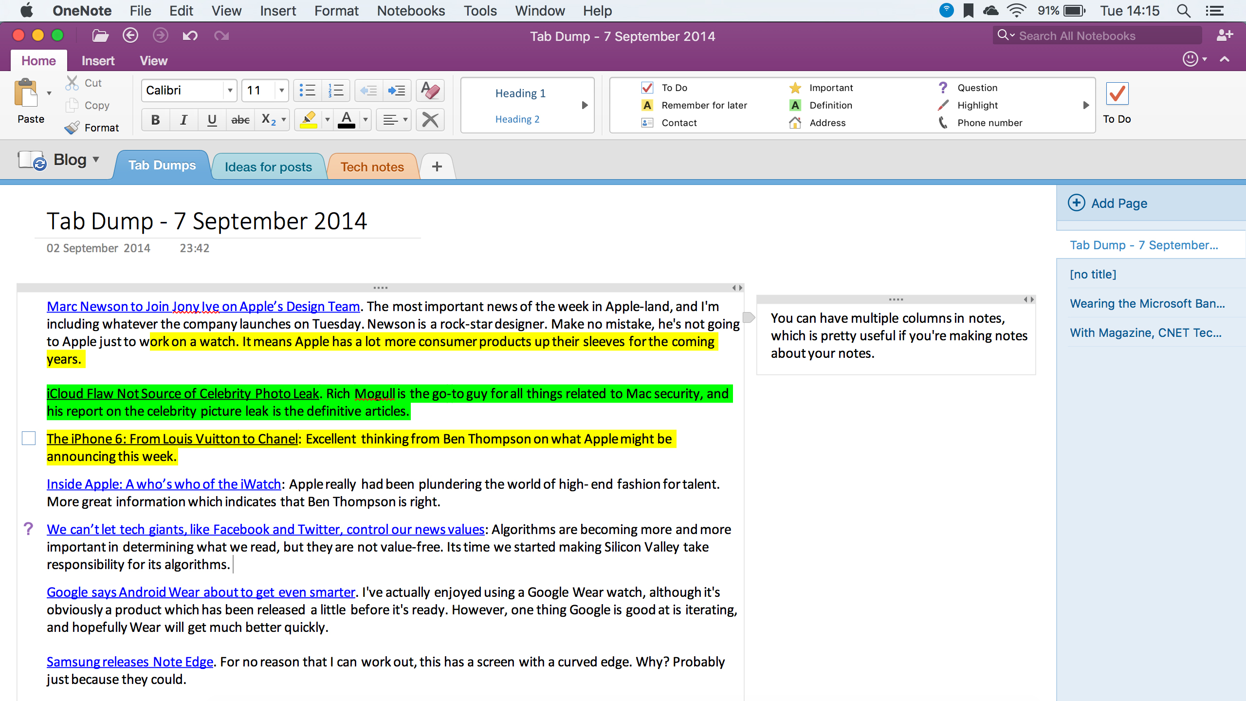
Notes themselves are incredibly powerful. You simply click anywhere in the editing area and start typing, and your words appear in place. Each note can have multiple text boxes, allowing you to layout notes however you like – for example, by creating a column for verbatim quotes from a lecture, and a second column of commentary later.
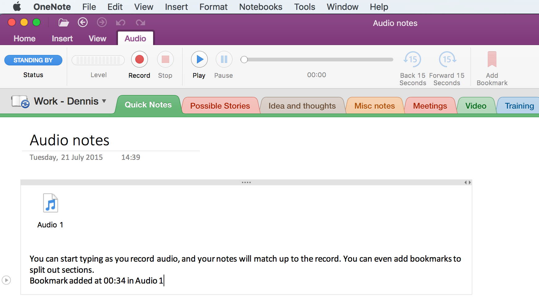
You can insert images into your notes, although there are no image-editing features included other than resizing or rotating, and OneNote can also record audio, which is handy for meetings. Better still, it remembers precisely what you were typing at all points of the audio recording. Click on the audio icon next to a paragraph in your note, and you’re taken straight to that part of the recording.
There’s also a convenient set of tools for common note-taking tasks such as highlighting, as well as a set of icons for checkboxes (handy for to do lists), question marks, and more. Although these all look good, there isn’t much you can do with them. You can’t, for example, find all of the notes in a notebook where you’ve highlighted something as “Remember for later”.
The formatting tools are excellent. In fact, it’s a bit like having a mini-version of Word (complete with Styles), and as you’d expect if you paste a Word document into OneNote, it will respect the formatting. Tables are supported, and include the ability to write simple formulae into a cell and have the results calculated, a little like a spreadsheet but without the power of linking calculations between cells.
One thing that’s missing in the Mac version of OneNote is the integration with Outlook. You can’t, for example, click on a button in Outlook and create a note for a meeting that you’re taking part in, complete with the agenda and attendees. Neither can you copy a message directly into OneNote. And there’s no integration with Outlook tasks, so you can’t create tasks directly from your notes as you can in the Windows version of Office.
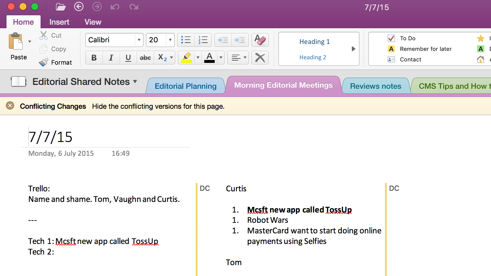
One thing that OneNote for Mac does support, though, is collaborative notebooks. Share a notebook with a group of people, and, unlike the other Office applications, changes made by others will happen in close to real-time. Edits appear with the initials of the editor adjacent to them, and if there’s a conflict, you can show or hide the conflicting changes, allowing you to decide which ones to respect and which to reject. And all this is cross-platform: you can have a notebook shared between Mac, Windows, iOS and Android users and all edit notes simultaneously.
Verdict
Overall, OneNote is a bit of a mixed bag. The audio features and ability to format notes in an incredibly flexible way are definite plusses. I miss the tagging element of Evernote, but finding poorly filed notes isn’t too hard with OneNote’s excellent search facility.
The collaboration features are the best of all Microsoft’s Office apps, but the lack of integration with the other apps – Outlook in particular – is puzzling and annoying, especially if you’ve come from the Windows version. It’s a very good note-taking app – but, with a little bit more, it could be a really great app. The fact that it doesn’t quite hit those heady heights is a shame.
Outlook for Mac 2016
Outlook for Windows is an incredibly powerful application which, if you can master all its features, allows you to manage your email, time and tasks incredibly well. Outlook for Mac, unfortunately, has never had the same range of capabilities.
However, at first glance, Outlook for Mac 2016 looks very much like its Windows sibling – to such an extent that I expected to find much of the same power lurking beneath the surface. Unfortunately, surface was almost all there was.
First, the good stuff: Outlook really does look terrific. There’s the classic three-pane view, with a well-arranged and easy-to-understand set of toolbars that’s consistent with the rest of the Office family. As with the Windows edition, access to Mail, Calendar, People, Tasks and Notes is via a set of buttons at the bottom of the screen.
It’s all about accessing all the information you have stored on your Exchange server, although it will work with IMAP and POP3, too. And it’s fast – compared to the last version of Outlook for Mac, really fast. You don’t find yourself waiting for anything.
The bad and the ugly
However, that’s where the good points end, and where it becomes obvious that you shouldn’t judge an email client on looks alone. Despite looking like the Windows version, Outlook for Mac is still very much “Outlook Lite”, and many of the features power users of Outlook have come to rely on are simply not there. There’s no scheduling of emails, for example, and no integration with OneNote – a great feature which makes keeping track of meeting notes much easier.
There’s also no integration with OneDrive, which seems silly in an application where you’re going to spend much of your time attaching documents to emails. Hit the attach button and all you get is the standard Finder dialogue – there’s no OneDrive option, as there is in all the other new Office applications.
All this would be perhaps forgivable if Outlook made use of Mac-specific features to compensate. But sadly, it doesn’t. There’s no integration with the system-wide address book, for example. There are no swipe gestures. There’s no full-screen mode, although every other Office application supports it. And the list goes on, and on. If it’s a Mac-only technology, it’s probably not there.
Even then, if Outlook coupled its speed with stability, I’d be tempted to use it. But it doesn’t do that, either. In use on both an iMac and a MacBook Pro, I found Outlook to be temperamental, crashing every few hours with no apparent pattern to it. Thankfully, this didn’t often mean lost work, but it was pretty irritating. Other users on the Alphr team have reported problems with the software when grabbing mail from POP3 servers.
Verdict
I’m left asking why, given that Apple Mail, Calendar and Contacts all support Exchange, anyone would use Outlook rather than the products that come bundled with all MacBooks and iMac desktops. And to be honest, unless you’re so wedded to the Microsoft way of working that you simply can’t exist without something that looks like Outlook, I can’t think of many reasons.
Outlook could be a really great application, if Microsoft applied the same level of understanding of business needs and workflow to it as it does to the Windows version. But it hasn’t, and Mac users should avoid using it until it does.
Disclaimer: Some pages on this site may include an affiliate link. This does not effect our editorial in any way.