You won’t see too many headlines about it, but one of the big changes between Windows Vista and Windows 7 is the taskbar.
Above, I’ve taken a grab of the three different ways it’s looked over the last eight years – from Windows XP at the top through Vista in the middle and Windows 7 at the bottom.
Compared to Vista, at first glance it may seem like Microsoft has simply made the quick launch icons larger, as you might expect with an OS that’s designed to be touch-friendly. In fact, the changes go a little deeper, and although in some ways they’re better they’re also, in other ways, a little worse.
In Vista, if a program shortcut was in the taskbar pressing it would start a new instance of that program – which is generally what you’d want, but could be a pain if the program was already open and you accidentally launched it again.
Windows 7 “solves” this by giving those shortcuts more than one use. If the program’s open, pressing the shortcut will either bring it to the fore (if you have only one active window) or show thumbnails of the active windows. Hover the cursor over a thumbnail and it will instantly show a preview of that window, minimising everything else.
And if it isn’t open, the program will launch.
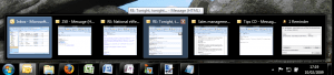
There is a minor irritation with this: what if you do actually want to launch a fresh instance of an application? This most frequently happens with Outlook: you close the main window, but there are still a couple of dialogs open (such as reminders or an email).
Then you press the Outlook icon, trying to launch the program, it only shows a preview of those two dialogs.
To actually launch Outlook again you’ve got to right-click the icon and select its name, or go through the usual route (such as pressing the Start menu and typing “Outlook”).
As far as I’m concerned, that’s a bug: Windows should be able to detect if a sub-window of a program is running rather than a full instance, shouldn’t it? Anyway, I’m certainly hoping that will be fixed by the time of final release.
Plus points
Despite this quirk, I’m still a big fan of the taskbar compared to the olde style Vista-cum-XP-cum-even-Windows 95 one. Correct me if I’m wrong, but I don’t think it’s fundamentally changed since those early days: if you had a program running it would appear as a rectangular box in the taskbar, and as soon as too many were simultaneously open they’d scrunch up and become unreadable.
Now, if you open a new program – say Calculator – the icon will simply appear in the taskbar and hovering your mouse over it will preview the open window (or windows). Even on a restricted 1,024 x 768 desktop, that means you can easily have a dozen programs open without feeling crowded, and be able to jump between them with ease.
 Admittedly, this does assume that you’ve switched to the small icons view (pictured above vs the standard icons view). This is something I’d recommend most people do immediately, unless they’re using a touchscreen, as to me the standard view seems a little too child-like – thanks Microsoft, but my mouse co-ordination is in fact good enough to stretch to icons smaller than a dinner plate.
As with most of the taskbar options, the simplest way to change things is to right-click on the bar. Want to get rid of an icon? Right-click it and choose to unpin it. Want to add a web address shortcut? As with Vista, again just right-click the taskbar and select it from the proffered toolbars.
Third-party insurance![]()
Windows 7 also deals far better with one of the nastier habits of third-party applications: to make a nuisance of themselves by invading the taskbar, as shown here with a screenshot from a colleague’s Vista system.
By default in Windows 7, you’ll only find the time and date, and sitting next to it a small upwards arrow. Click on this to reveal all the other applications and notifications that would normally litter the area: wireless network and battery status, antivirus, and a multitude of others.
This blissful solitude is  only interrupted if an application needs to notify of you something; say your battery is running low or your AV database is out of date.
This level of information won’t be enough for many people, but it’s easy to change the behaviours. If you always want to see the wireless network status, simply click on the Customize link shown above (or right-click on the taskbar, click Properties and then select the Customize button) and you’ll be taken to this screen.
Personally, I like to see both battery and network status, plus the Action Center flag. This highlights any security and maintenance issues, and if nothing else gives a certain amount of peace of mind.
Like I said at the top of this blog, I don’t think the taskbar is going to get many headlines, and when someone asks me “why should I upgrade to Windows 7?” I realise it’s going to be a tough sell to point them to this thin strip of black at the bottom of the screen.
But it does make a big difference to everyday working and is yet another small reason why I’m sure Windows 7 is going to be success.
Disclaimer: Some pages on this site may include an affiliate link. This does not effect our editorial in any way.