Nowadays, nearly everyone uses Microsoft Office daily. Even though most people claim that they are proficient in Office, that is far from the truth. Excel, in particular, is not even remotely easy to use, especially if you’re not tech-savvy.
No matter if you’re a student, business owner, or you like graphs and charts, you need to know how to use Excel. One of the most asked questions regarding Excel is how to change the X-Axis, also called the horizontal axis.
Read on and find out how to do this, both in terms of the axis range and the axis intervals.
Excel Charts 101
Charts in Excel are not that complicated when you know what to expect. There is an X-axis and a Y-axis. The former is horizontal, and the latter is vertical. When you change the horizontal X-axis, you change the categories within it. You can also change its scale for a better view.
The horizontal axis displays either date or text, showing various intervals. This axis is not numeric as the vertical axis.
The vertical axis shows the value of the corresponding categories. You can use many categories, but mind the size of the chart, so it fits an Excel page. The best number of data sets for a visible Excel chart is between four and six.
If you have more data to show, perhaps split it into multiple charts, which isn’t hard to do. The X-axis changes we are about to show you should work in all versions of Excel, i.e., the Microsoft Office packages.
How to Change the X-Axis Range
The X-axis range is not hard to change, but you have to think in advance and decide what types of changes you want to make. You can change many things, including the axis type, labels of categories, their positioning, and the merging point of the X and the Y-axis.
Follow the steps to start changing the X-axis range:
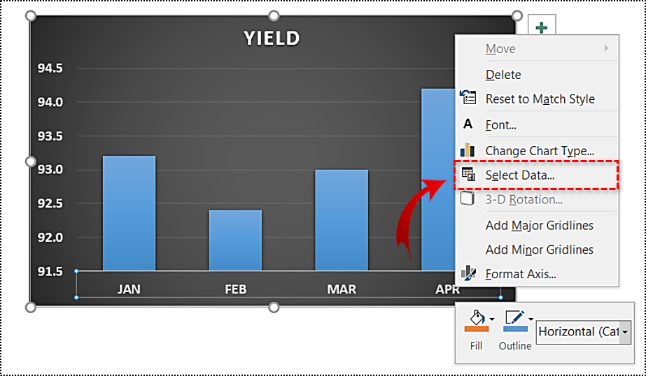
- Open the Excel file with the chart you want to adjust.

- Right-click the X-axis in the chart you want to change. That will allow you to edit the X-axis specifically.
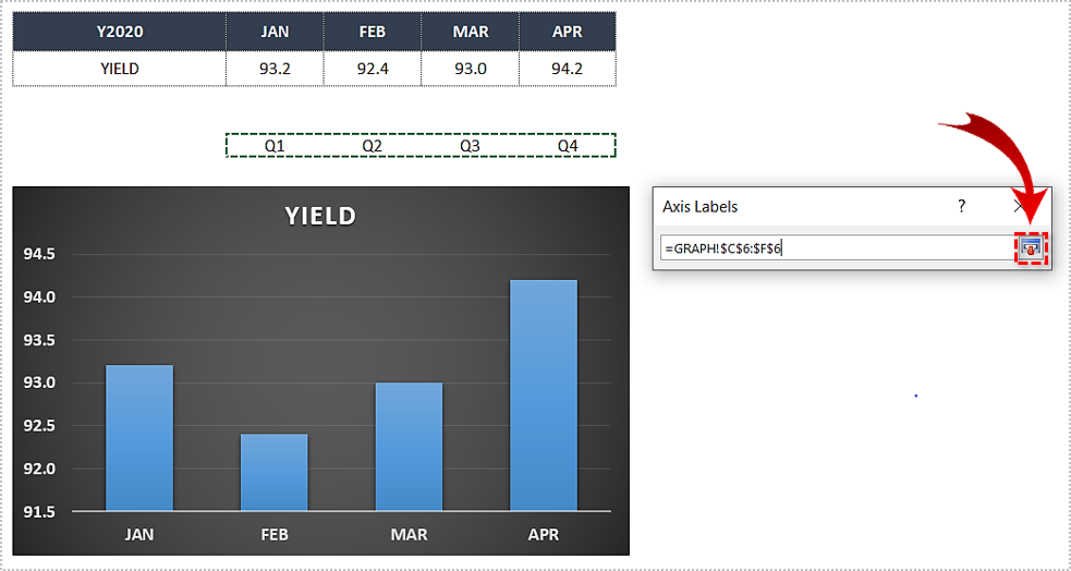
- Then, click on Select Data.
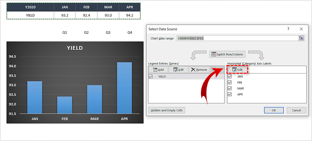
- Select Edit right below the Horizontal Axis Labels tab.
- Next, click on Select Range.
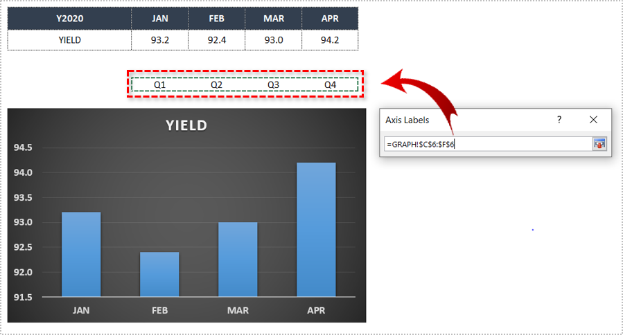
- Mark the cells in Excel, which you want to replace the values in the current X-axis of your graph.
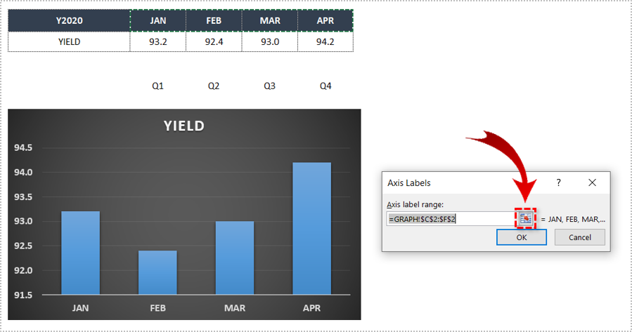
- When you select all the desired cells, tap on Select Range once more to confirm.
- Finally, click the OK button, and the values will be replaced with your selection.
- Click on OK once again to exit the Select Data Source window.


How to Edit the X-Axis
We also mentioned other changes, and here is how to make them. Follow the steps to make additional X-Axis changes:
- Open the Excel file containing the chart you want to change.
- Click the Graph with the X-axis you want to edit.
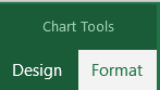
- Now, choose Chart Tools.
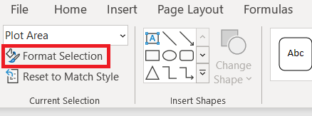
- Then, click on Format from the list at the top of the screen.
- Next, select Format Selection, it’s located just under File near the top of the screen.
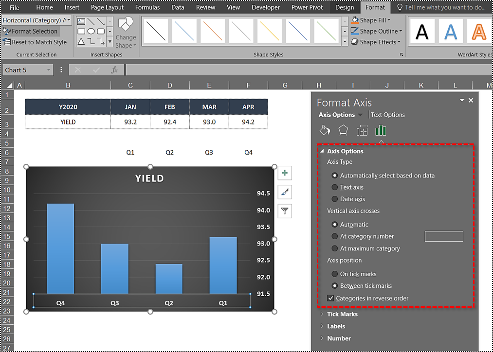
- Click on Axis Options >Values in reverse order, to change how categories are numbered. .
- If you want to change the merging point of the X and Y axes, select Axis Options and adjust the maximum value. Here you can change the interval of tick marks, thus changing the spacing in your chart.

 .
.
How to Change X-Axis Intervals
Finally, you can also change the X-axis intervals. This can be helpful to make your graph more readable, or more specific. Simply follow these instructions:
On a Text-Based X-Axis
Follow the instructions to change the text-based X-axis intervals:
- Open the Excel file and select your graph.
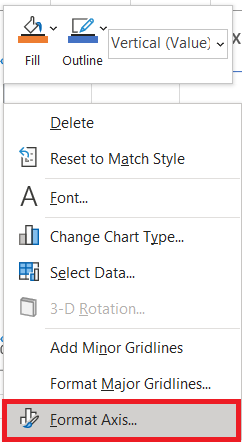
- Now, right-click on the Horizontal Axis and choose Format Axis… from the menu.
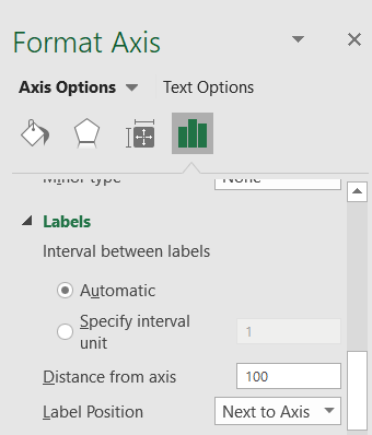
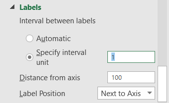
- Select Axis Options > Labels.
- Under Interval between labels, select the radio icon next to Specify interval unit and click on the text box next to it. Type your desired interval in the box. You can also leave it at one.
- Close the window, and Excel will save the changes.

Horizontal Axis Changed
That is how you change the X-axis in an Excel chart, in any version of Microsoft Excel. By the way, you can use the same steps to make most of the changes on the Y-axis, or the vertical axis as well, depending on the type of change.
Excel is not an easy program, but hopefully, you managed to follow these steps and make the necessary changes to your charts. If you’d like to add something, please do so in the comments section below.
Disclaimer: Some pages on this site may include an affiliate link. This does not effect our editorial in any way.