The design buttons on Figma can be created in different ways by utilizing component and auto-layout properties on the platform. As such, buttons can be customized using labels, sizes, and icons. If you’re not sure how to create buttons on Figma, you’ve come to right place.
This article will explain how to create buttons and how to make the most out of Figma.
Creating a Button
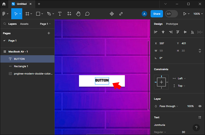
Buttons are common elements used when designing a functional user interface. You can create a button in a Figma design. If you’re new to Figma, you must first grasp the basics.
Here’s a step-by-step guide for creating buttons:
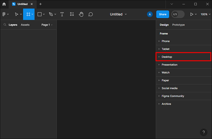
- Create a new Figma design.
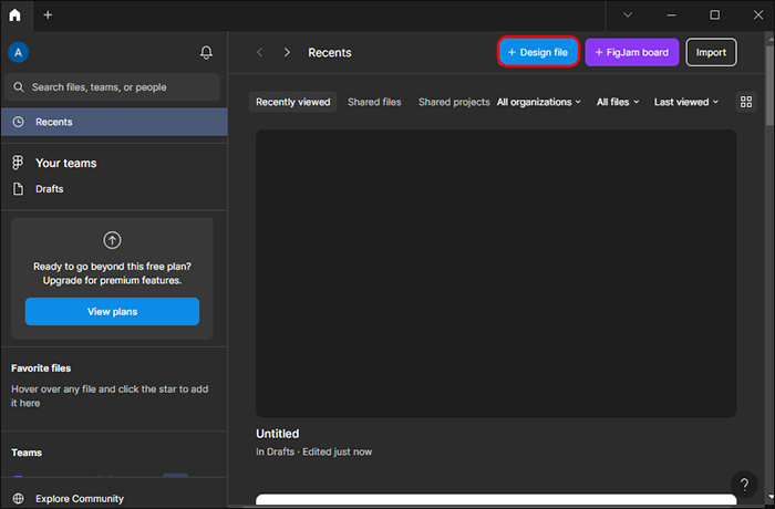
- Add a frame by pressing the F key on your keyboard, then select “desktop” or “phone.”

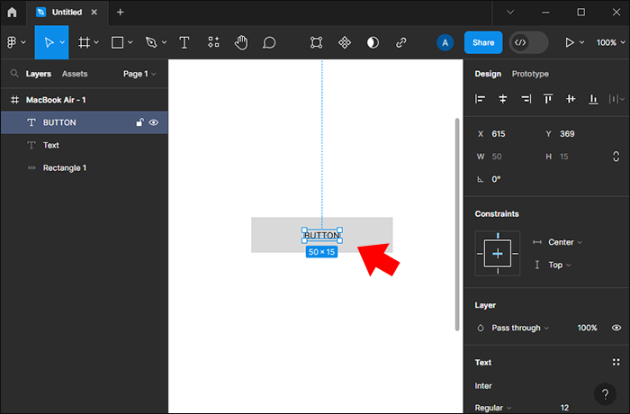
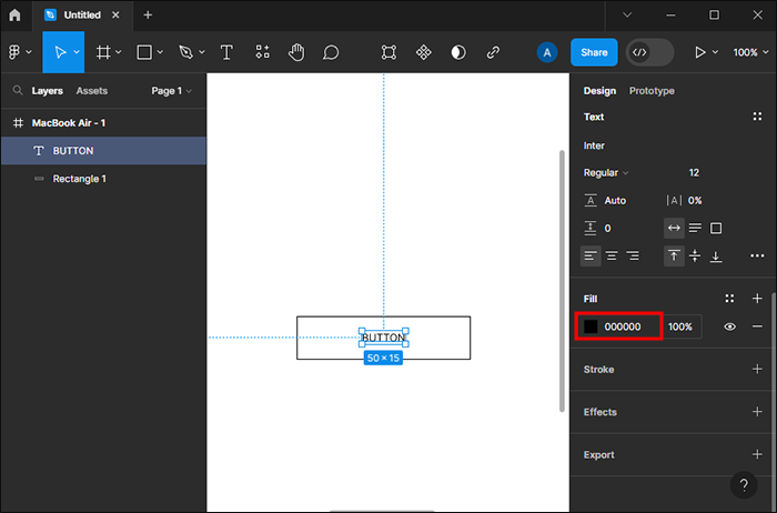
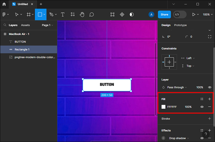
- Add a rectangle with 50px height and 200px width dimensions using the keyboard R key.
- Add text by pressing “T” on your keyboard. Center your text so that it is in the middle of your textbox horizontally and vertically.
- Place this textbox in the middle of your rectangle.
- Group components as you want them to be.


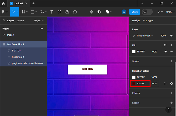
You can add colors by creating some using the color picker, or you can access hexadecimal colors from the internet.
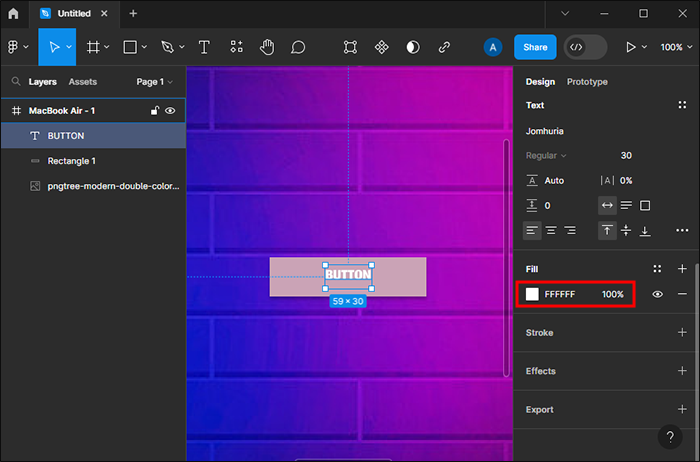
Contrast
The text color within the button depends on whether it contrasts better with a black or white background. You can use both options to see which one works best. If you don’t like any of the options, you can adjust the button style and color.
Creating Basic Buttons
There are three basic buttons that can be created on Figma.
Primary Button
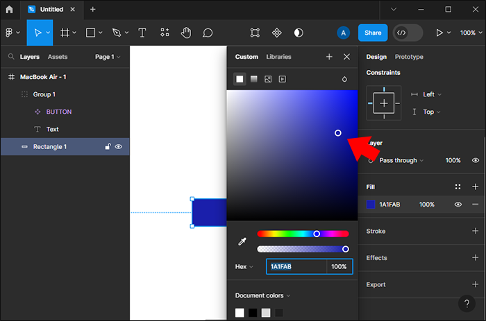
Primary buttons are solid colors with black or white text. This button draws the users as they use an app. This is how you can create one:
- Pick a color for your button.
- Choose the rectangle, then apply the selected color.
- Color text in white or black, depending on the better contrast.
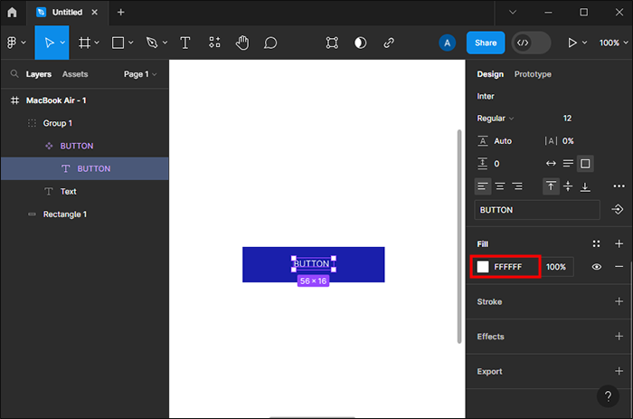
Secondary Button
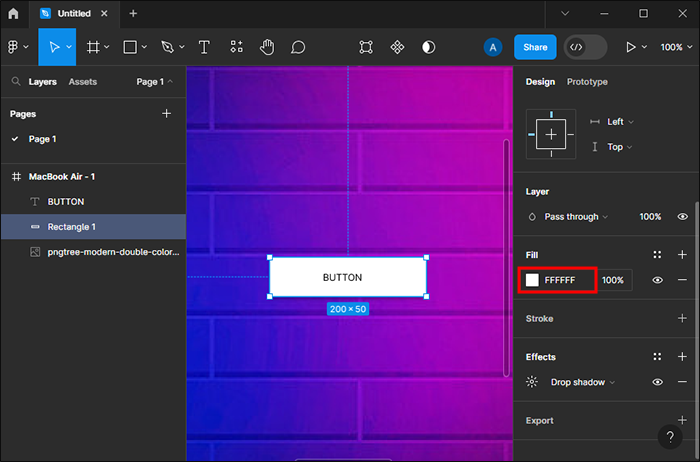
This is usually a white button but outlined with the color you choose. The button text can bear the same color as well. This is the second most important button you can create. It should also draw the user’s eyes.
- Change the color of your rectangle to white (#FFFFFF).
- In the rectangle, add a stroke. You can choose the color you prefer here.
- Change your text color to bear the same color as the text.

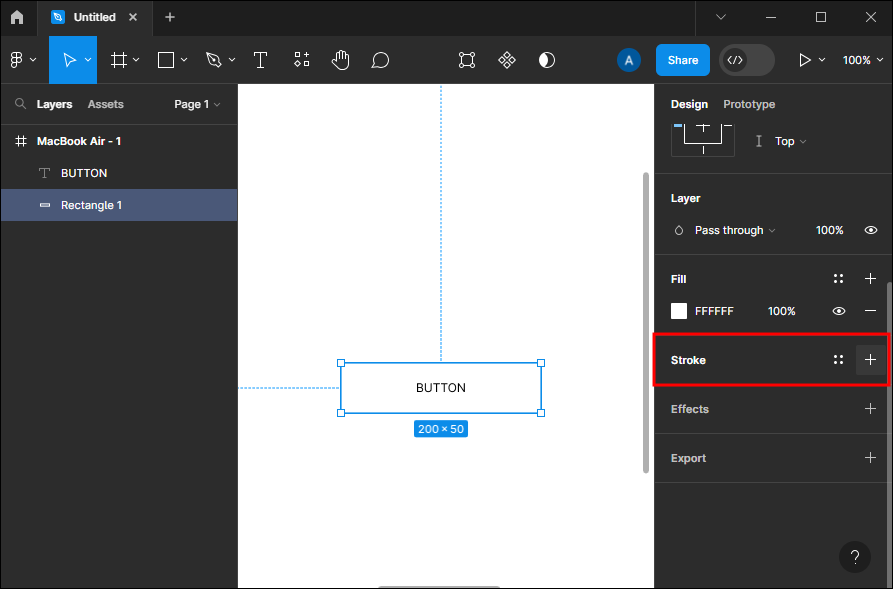
Tertiary Button
Tertiary buttons aren’t as important as the first two. They can function as the link, unsubscribe, or back buttons. They are often in plain text and can be underlined in some instances.
- Make your rectangle white with no stroke.
- Change the text color to what you prefer.
You can create a tertiary button that resembles a primary or secondary button. You can also change the stroke width to get better visibility.
Create a Button Using Text, Auto Layout, and Color
With the tools on the platform, you can get hands-on experience using Auto Layout and Text Tool. With step-to-step guidance, creating a button should be relatively simple to achieve. To create a button, you need to create your text layer, convert your text layer to an auto layout frame, and style your button.
Creating a Text Layer
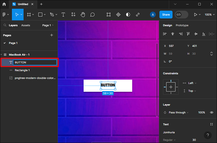
In this step, the text tool is used.
- Tapping the text tool in the toolbar or pressing the letter “T.”
- When the Text tool is active, tap on your canvas, and enter the word “Button.” Note that the text layer name will match whatever is typed on the canvas unless it’s manually changed within the layers panel.
- If the layer name needs to be changed, double-click the left sidebar, then type in the new name you’ve chosen.
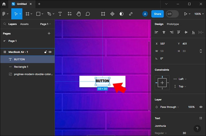
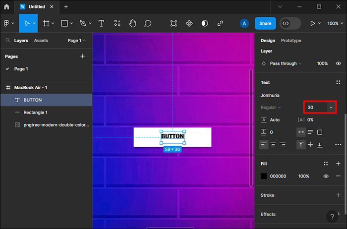
Now, you can also play around with font size by increasing or decreasing it.
- Select your text layer.
- Navigate to the right sidebar, and change the font size on the “Text” section. You may also change the font or stick to the default option.
Convert Your Text Layer Into Auto-Layout Frames
At this point, the button needs to be tweaked further to make it look glamorous. With the auto layout, you can spice things up a little more. Auto layout is a powerful feature on Figma and can be applied for responsive designs. These designs automatically adapt to changes like content size, object placement, and device type.
The auto layout may be applied to turn layers into frames or to existing frames. To apply the layout to an existing frame, select your text layer, then press the “Shift” “A” shortcut. Once the layout has been applied, you’ll notice some changes.
- The text layer will be within a frame. Auto layout is only applied to components and frames, so Figma places the text layer within the new frame automatically. The frame doesn’t have a fill color. This is applied in the button styling step.
- When selecting your frame, auto layout settings are displayed on the right sidebar. The auto layouts can be tweaked further.
- You notice that the frame shrinks and grows with text changes. With such dynamic elements, you save time taken to design the content viewed on various devices or translated to other languages.
Styling the Button
You may start by adding color.
- Pick a frame layer, then choose “Fill settings” within the right sidebar. This fills the color
automatically. The color picker changes the color. - Select the text layer and adjust the fill to #FFFFFF.
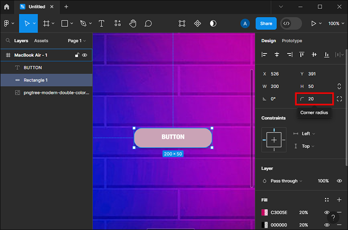
- Choose the frame again, then use the right sidebar setting to adjust the corner radius.
The next thing is to fix the frame padding. After the letter text is converted to an auto frame layout, a padding is automatically added between the text and the frame boundary. The padding at this point appears equal on all sides. You can change the bottom and top padding to be smaller than the right and left padding.
You can update padding as you please. The left and right padding or the top and bottom padding can be changed at the same time with the shortcuts below:
- Hold <⌥ Option> or <Alt>, then click the padding area to input padding value for opposite sides
- Hold <⌥ Option> or <Alt> while dragging handles to change padding for opposite sides
At this point, the button looks good, but you can still update the label. You need to double-click the text to allow editing. Type the words “Sign up.” The button resizes as you type. This is how you design a button using the auto layout and text tool. You can now try something new, like turning the button into a component or adding a variant.
Making a Clickable Button
Figma is used by companies like Uber, Facebook, Google, and Netflix. The clickable button feature makes it easier for designers in such companies to create interactive and clickable buttons. The buttons make navigation much easier on such platforms.
Here’s how to develop such buttons in Figma:
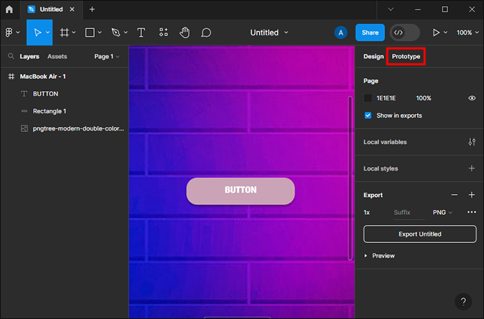
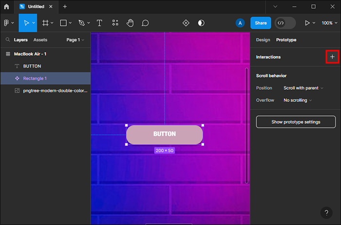
- Choose the “Prototype” option in the menu (right).
- Click the “Plus” (+) icon found below the Prototype tab. This allows you to add an interaction.
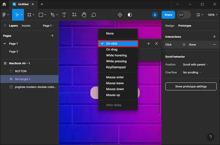
- Choose “On click” within the interaction details window.
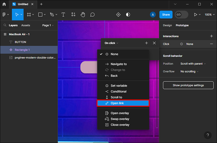
- Select the “Open link” option.
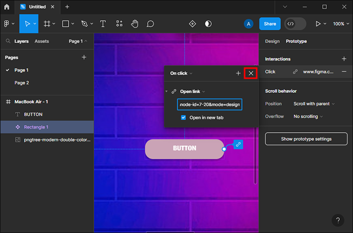
- Add the page link where the button will direct once clicked.
- Tap the “X” icon to exit the Interaction details window.
- Navigate to the “Play” option button in the upper right corner.
- Tap the “Play” button to get a design preview.

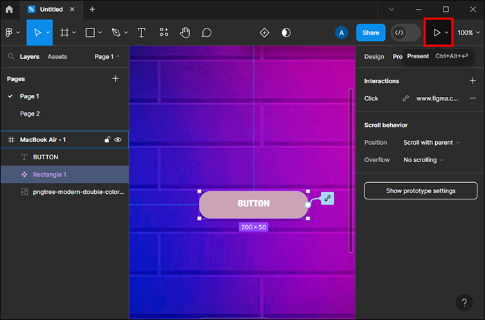
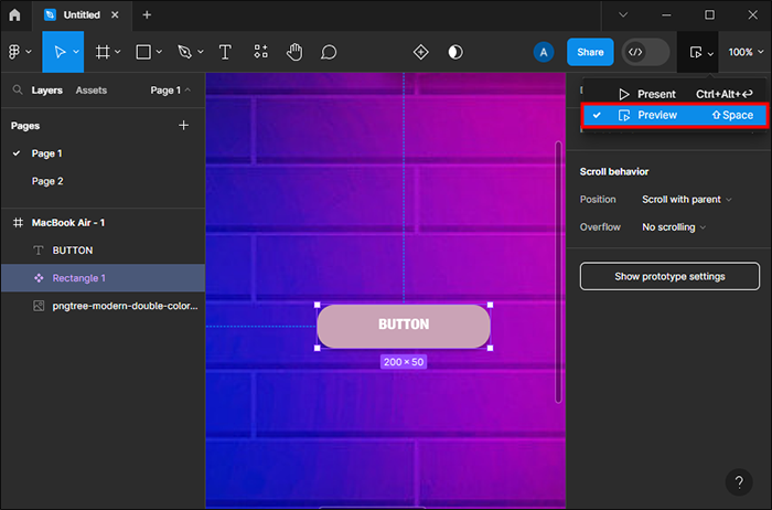
If you hover the cursor over your button, it changes to a hand-like icon. This indicates that the button is now clickable.
Note: When creating the clickable Figma button, always use “On click,” not “On drag.” “On click” allows adding a clickable link to the button possible. “On drag” buttons can’t be clicked.
Design Better With Figma Buttons
Figma buttons have variables like theme, state, internal padding, table length, width, and height. By learning how to create buttons on the platform, you can make the most out of Figma and add value-using components within the Figma library.
Have you tried creating buttons on Figma? If so, what was your experience like? Let us know in the comments section below.
Disclaimer: Some pages on this site may include an affiliate link. This does not effect our editorial in any way.