When Apple launched iTunes 11 in late 2012, many longtime iTunes users were shocked to find their beloved sidebar absent after upgrading. Thankfully, a quick trip to the Menu Bar could restore the missing sidebar, but history looks to be repeating itself with the first beta of iTunes 12, released to developers this week.

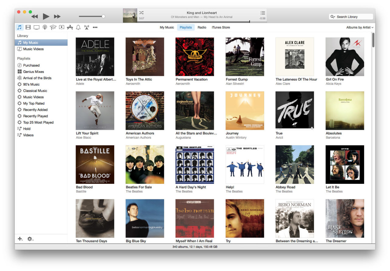
The upcoming version of iTunes unsurprisingly introduces a visual overhaul inspired by what’s been seen thus far of OS X Yosemite. Each media section can now be found via its own icon in the iTunes navigation bar, and the iTunes sidebar is once again missing by default.
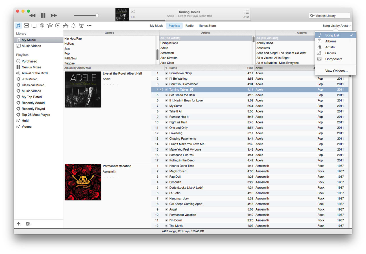
Unfortunately, users won’t find a “show sidebar” option in the iTunes 12 menu structure, and there’s no reference to the sidebar at all. But all is not lost! Apple has maintained the sidebar-style interface for the Playlist view of each media section.
To see it in action, select a media section from the icons on the left of the iTunes navigation bar then click the Playlist button at the center of the navigation bar. The screenshots demonstrate this process with music, but it works the same for all forms of iTunes content.
Voilà! The iTunes sidebar returns! Well…at least, sort of. Unlike the sidebar in previous versions of iTunes, this sidebar view in iTunes 12 only displays the current content category. That is, when you’re in the music section, you won’t see movies, TV shows, or podcasts listed in the sidebar, although playlists do persist between sections, allowing users to build playlists comprised of various types of media.
Also of note, the traditional iTunes list view is still available, but you’ll find it now in the drop-down on the right of the navigation bar as “Song List” with various user parameters (e.g., Song List by Album, Song List by Artist).
It’s clear that Apple is trying to steer users away from the sidebar, and the company’s default album view is visually impressive. But longtime iTunes users who prefer the “traditional” iTunes layout may be fighting a losing battle with Apple. It’s great that the company preserves some forms of sidebar and list views in iTunes 12, even if they’re harder to find and lack some functionality, but how much longer will Apple continue quietly relegating these layouts before they’re gone completely?
iTunes 12 and OS X Yosemite are still in beta, of course, and won’t launch until the fall. Apple could continue to refine the iTunes user interface during that time. It’s also worth noting that Apple made several significant functionality and layout updates in the months following the release of iTunes 11, and could follow suit with iTunes 12.
Disclaimer: Some pages on this site may include an affiliate link. This does not effect our editorial in any way.