Excel offers a simple way to arrange and display your data, making it easily readable. One of the options is to create charts to help you present or compare collected data. It typically entails more than one line on the same chart, so you’ve come to the right place if you’re unsure about plotting multiple lines in Excel.
Keep reading to learn how to create an Excel chart with multiple plot lines.
How to Plot Multiple Lines in Excel
Excel allows you to plot data in various chart types. Users have found the scatter chart and line chart to be the most useful for clearly presenting data.
These two chart types look similar, but they approach plotting data along the horizontal and vertical axis differently.
A scatter chart will never display categories on the horizontal axis, only numerical values. In fact, both axes show sets of numerical data and points of their intersection, thus combining the values into single data points.
In contrast, a line chart displays separate data points equally distributed along the horizontal axis. The vertical axis is the only value axis in a line chart, whereas the horizontal axis shows the data categories.
With this in mind, you should use scatter charts for:
- Displaying and comparing numerical values in statistical and scientific data.
- Showing the relationship between the numerical values in various data series.
- Plotting two groups of numbers to display a series of XY coordinates.
As for the line chart, it’s best to use it for:
- Displaying continuous data over time against a common scale.
- Showing trends over time or at equal intervals.
- Non-numeric x values.
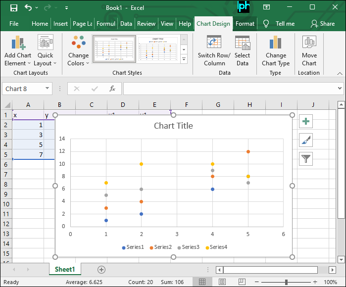
How to Plot Multiple Lines in a Scatter Chart
A scatter chart is a beneficial and versatile chart type. Best of all, you can create it in five simple steps.
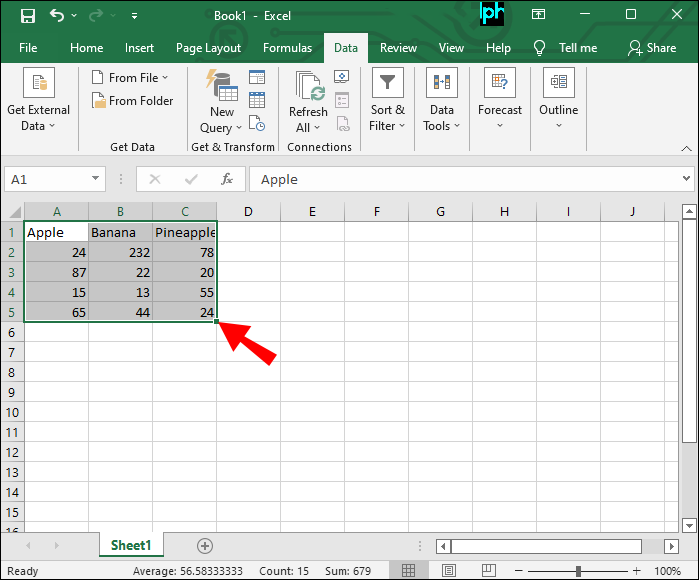
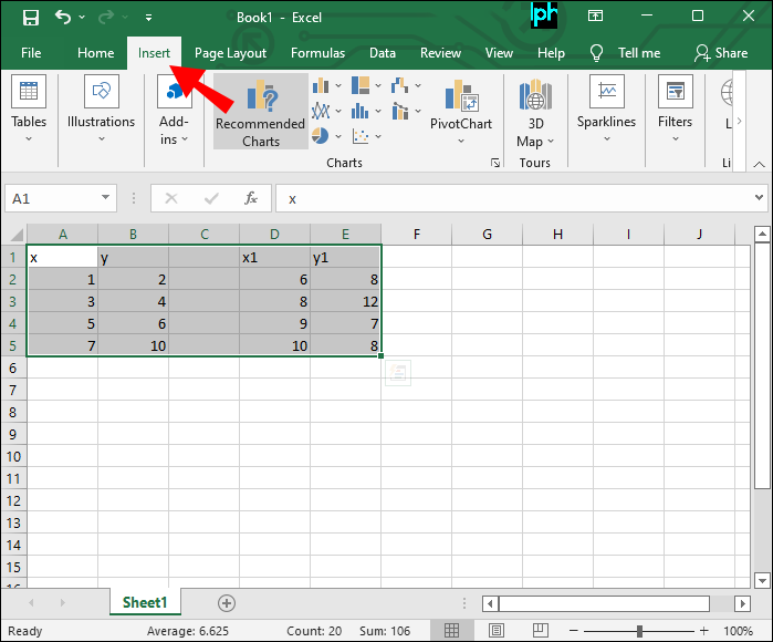
- Open the worksheet containing the data you want to plot.

- Select the data.

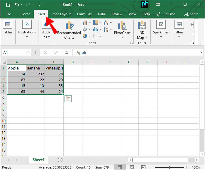
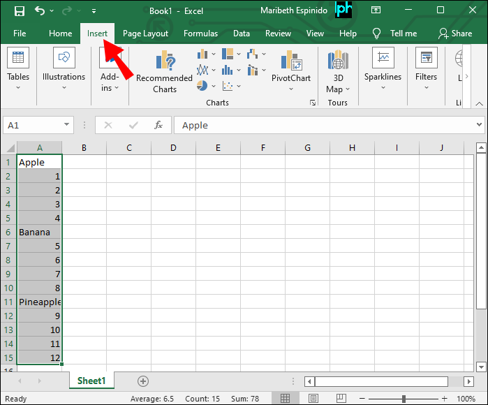
- Click on the “Insert” tab.
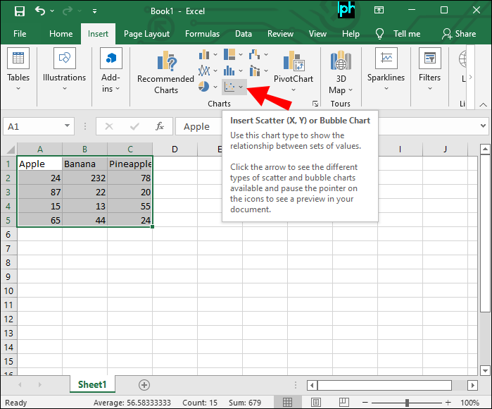
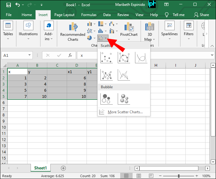
- Select the “Insert Scatter (X, Y) or Bubble Chart” option.
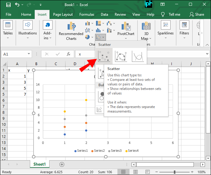
- Tap “Scatter.”

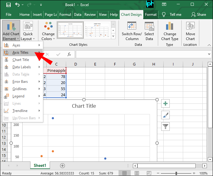
Now it’s time to name your axes so that anyone can understand the displayed data:
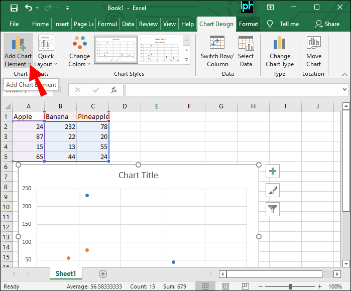
- Navigate to the “Design” tab.
- Press “Add Chart Element.”
- Select “Axis Titles.”
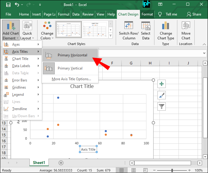
- Name your horizontal axis under “Primary Horizontal.”
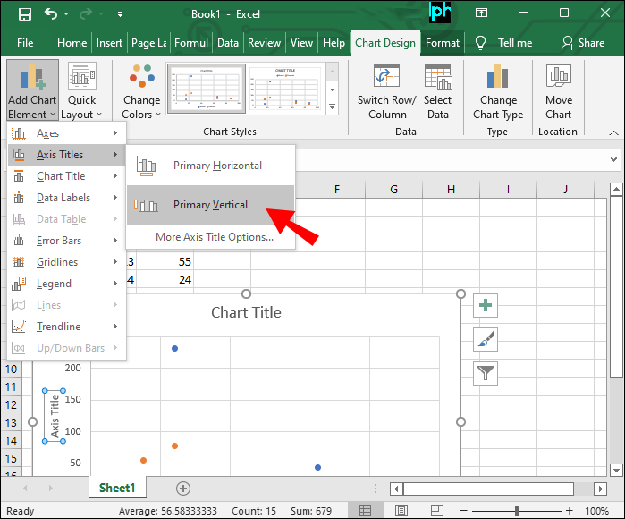
- Choose “Primary Vertical” to add a vertical axis title.
- Hit “Enter.”

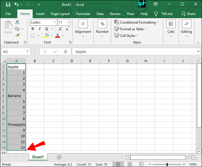
The best way to organize your data for a scatter plot is to place the independent variable in the left column and the dependent in the right.
How to Plot Multiple Lines in a Line Chart
A line chart offers a straightforward way to plot multiple lines in Excel, especially when your data includes non-numerical values.
Follow these steps to plot multiple lines in a line chart:
- Open the worksheet with the data you want to plot.
- Place each category and its associated value on one line.
- Select the data to plot in a line chart.
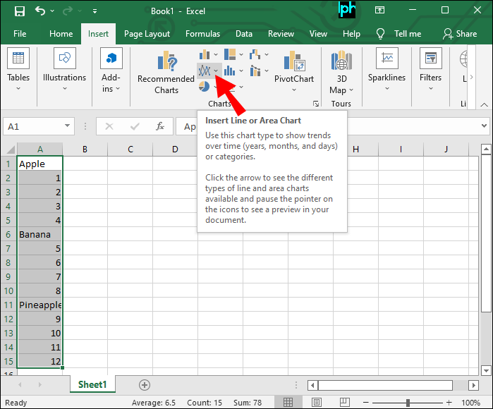
- Go to the “Insert” tab.
- Tap the “Insert Line or Area Chart” button under “Charts.”
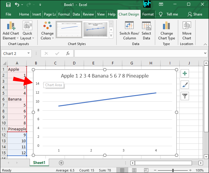
- Select the “Line” chart under the “2-D Line” tab.


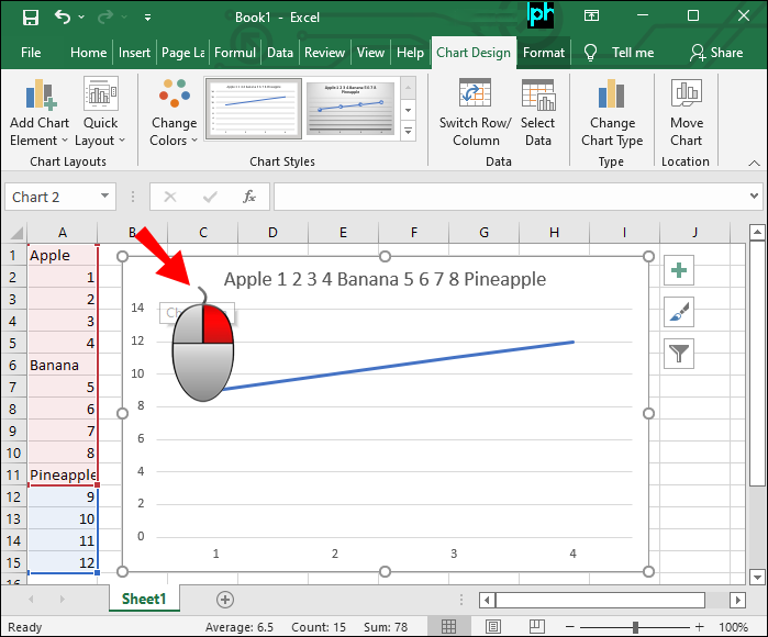
Now you can see the plot lines in your line chart. You can add a legend containing the title of the chart and the name of your data.
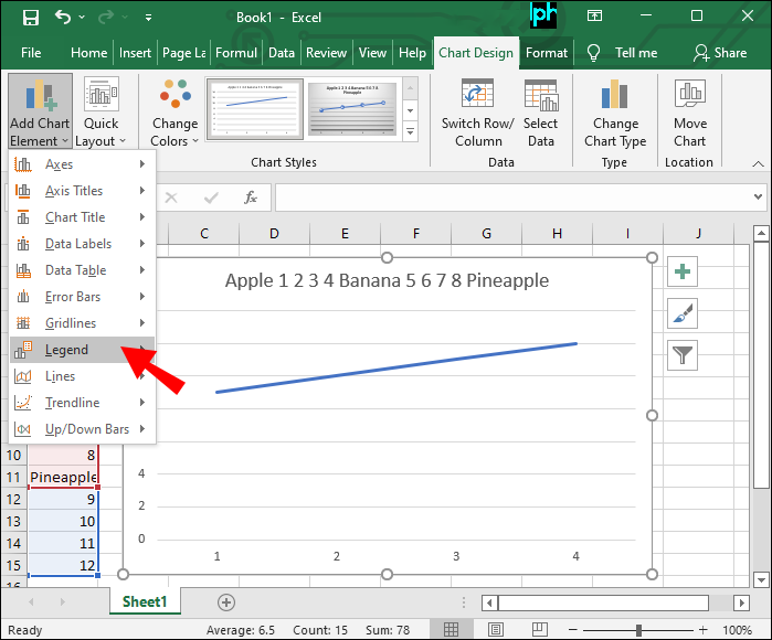
- Click on the chart.
- Press the “Add Chart Element” button at the top left.
- Scroll down to “Legend.”

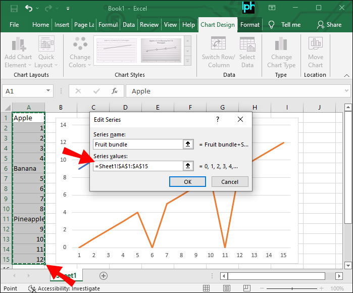
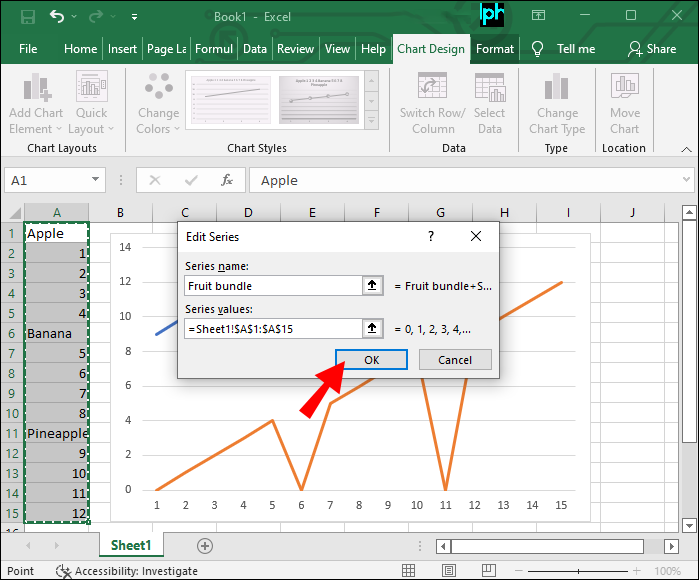
If you’d like to add more data after already creating a chart, follow these steps:
- Right-click on the chart.
- Go to “Select Data…”
- Tap the “Add” button under “Legend Entries (Series).”
- In the “Edit Series” pop-up window, type your series’ title in the “Series name” field.
- Set the “Series Values” by highlighting the necessary fields.
- Click “OK.”


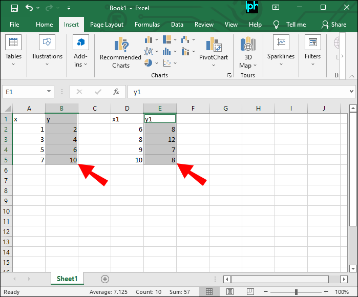
How to Plot Multiple Lines in Excel With Different X Values
If you have multiple X values and a single Y value, a scatter chart will do the trick. It’s just a matter of organizing your columns correctly.
When entering data, do the following:
- Put in the X values first, organized in adjacent columns.
- Place the Y values in the final column.
Now your data is ready to be used in a scatter chart.
- Select the columns containing your data.
- Go to the “Insert” tab.
- Tap the “Insert Scatter (X, Y) or Bubble Chart” option.
- Select “Scatter.”

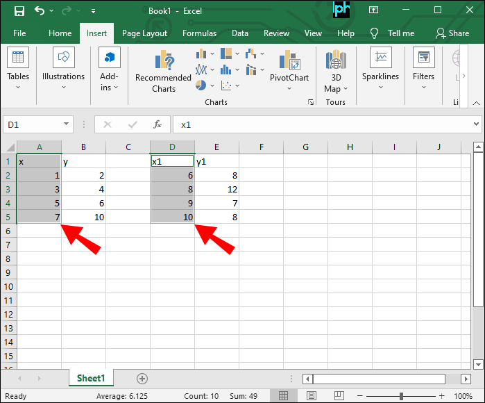
How to Plot Multiple Lines in Excel With Different Y Values
Excel allows you to plot multiple Y values against a single X value. The crucial part is distributing your data correctly. After that, you just need to follow several straightforward steps to generate a scatter chart.
When putting in your data, make sure that:
- The X values are located in the first column.
- The Y values are located in the adjacent columns.
To plot these lines, do the following:
- Select the data you want to display in the chart.
- Click on the “Insert” tab.
- Select the “Insert Scatter (X, Y) or Bubble Chart” option.
- Tap “Scatter.”
How to Plot Multiple Trendlines in Excel
Trendlines are typically used to display data movements over time or correlations between two sets of values. They can also be used to forecast trends.
Visually, trendlines are similar to a line chart. The key difference is that trendlines don’t connect the actual data points.
You can add a trendline to various Excel charts, including:
- Scatter
- Bubble
- Stock
- Column
- Area
- Line
Follow these steps to add a trend line to your scatter chart:
- Create a scatter chart.
- Click anywhere in the chart.
- Tap the “cross” button on the right side of the chart.
- Select the “Trendline” checkbox.


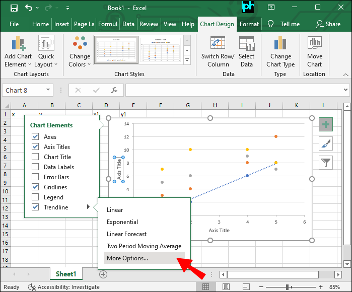
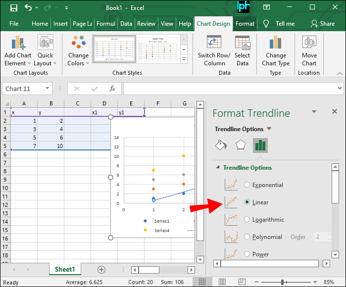
This checkbox will add a default linear trendline to your chart. If you’d like to insert another type, do the following:
- Click on the arrow next to the “Trendline” checkbox.
- Select “More Options.”
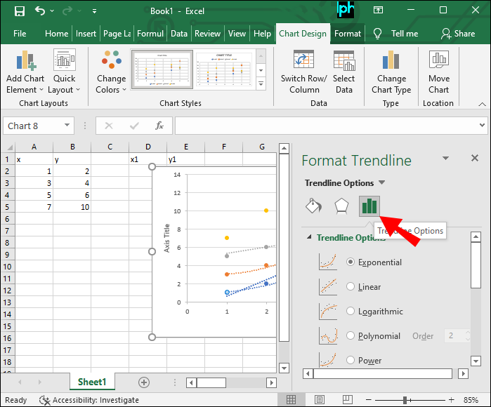
- Tap the “Trendline Options” tab in the “Format Trendline” window.
- Choose the type based on the data series plotted in your chart.


To add multiple trendlines, simply right-click each data point of interest in your chart and repeat the steps above.
How to Plot Multiple Regression Line in Excel
Regression lines display a linear relationship between dependent and independent variables. They aim to show how strong the relationship between various factors is and whether or not it’s statistically significant.
To chart a regression in Excel, do the following:
- Highlight your data and chart it as a scatter plot.
- Tap the “Layout” icon from the “Chart Tools” menu
- Select “Trendline” in the dialogue box
- Click on the “Linear Trendline.”
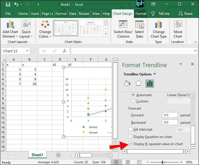
The R2 (R-squared) value shows how well the regression model fits your data. This value can range from 0 to 1. Generally speaking, the higher the value, the better the fit.
Here’s how you can add the R2 value to your chart:
- Click on the “More Trendline Options” under the “Trendline” menu.
- Tap “Display R-squared value” on the chart.
Plot Out Your Success
Correctly plotting data is a crucial step in creating a trustworthy chart. If you fail to do so, your data may look better or worse than it really is, creating incorrect forecasting. To avoid misleading results, follow the steps outlined in our guide to plot any lines and variables properly.
Have you tried to plot multiple lines in Excel? Which chart type did you use? Let us know in the comments section below.
Disclaimer: Some pages on this site may include an affiliate link. This does not effect our editorial in any way.