Earlier this year, Microsoft unveiled its vision for the future of Windows on the desktop, and Windows 10 proved a great improvement over Windows 8.1. Now it’s the turn of Microsoft’s mobile OS and, after months of user feedback, it’s finally available in its finished, official guise: Windows 10 Mobile.
Arguably, it’s an even bigger deal than Windows 10 on the desktop. The introduction of Universal apps, which run the same code on phone and desktop, is something that’s never been attempted before in the mobile space, and it could eventually turn the smartphone world on its head. The changes Microsoft has made to bring the UI of the phone in line with that on the desktop could also help broaden the appeal of Windows 10 Mobile.
Windows 10 Mobile review: Which phones will receive the free upgrade?
The first people to experience the final, complete version of Windows 10 Mobile – aside from those on the Insider Program – will be anyone who buys a Microsoft Microsoft Lumia 950 or Lumia 950 XL smartphone. Owners of existing handsets will also be upgraded, but this will happen in stages.
The phones in the first wave of upgrades are listed below. The final complete list of phones set to receive the upgrade hasn’t been finalised yet, but Microsoft has said it has ambitions to upgrade all handsets currently running the Denim update to Windows 10.
Note, though, that some of the new features of Windows 10 – namely Windows Hello and Continuum – are hardware-specific and, as such, won’t be available on older handsets.
-
Lumia 430
-
Lumia 435
-
Lumia 532
-
Lumia 535
-
Lumia 540
-
Lumia 640
-
Lumia 640 XL
-
Lumia 735
-
Lumia 830
-
Lumia 930
Windows 10 Mobile review: What’s new?
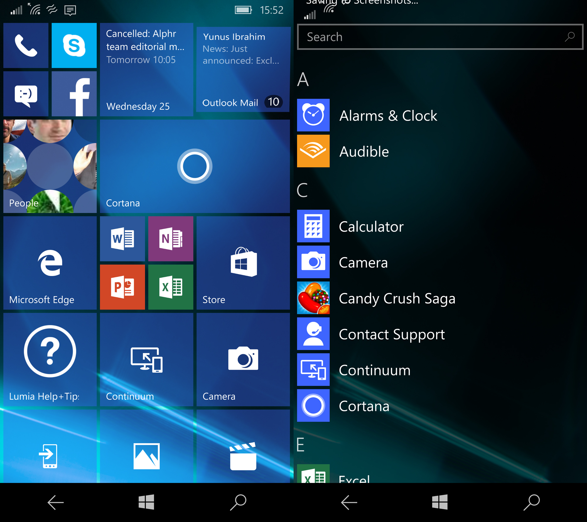
At first glance, you’d be forgiven for wondering what all the fuss is about. The lockscreen and homescreen look largely as they did in Windows Phone 8.1, and that’s a good thing. After all, Windows Phone’s biggest strength, and what sets it apart from Android and iOS, has always been its vertically scrolling, data-rich Live Tiles.
It doesn’t take much digging before the changes begin to emerge, however, and the most obvious are to be found closest to hand in the Action Center notifications menu.
The first time you look, you’ll see the same four toggle buttons along the top of the menu, with notifications lined up beneath. Look closer, though, and you’ll see a number of subtle alterations.
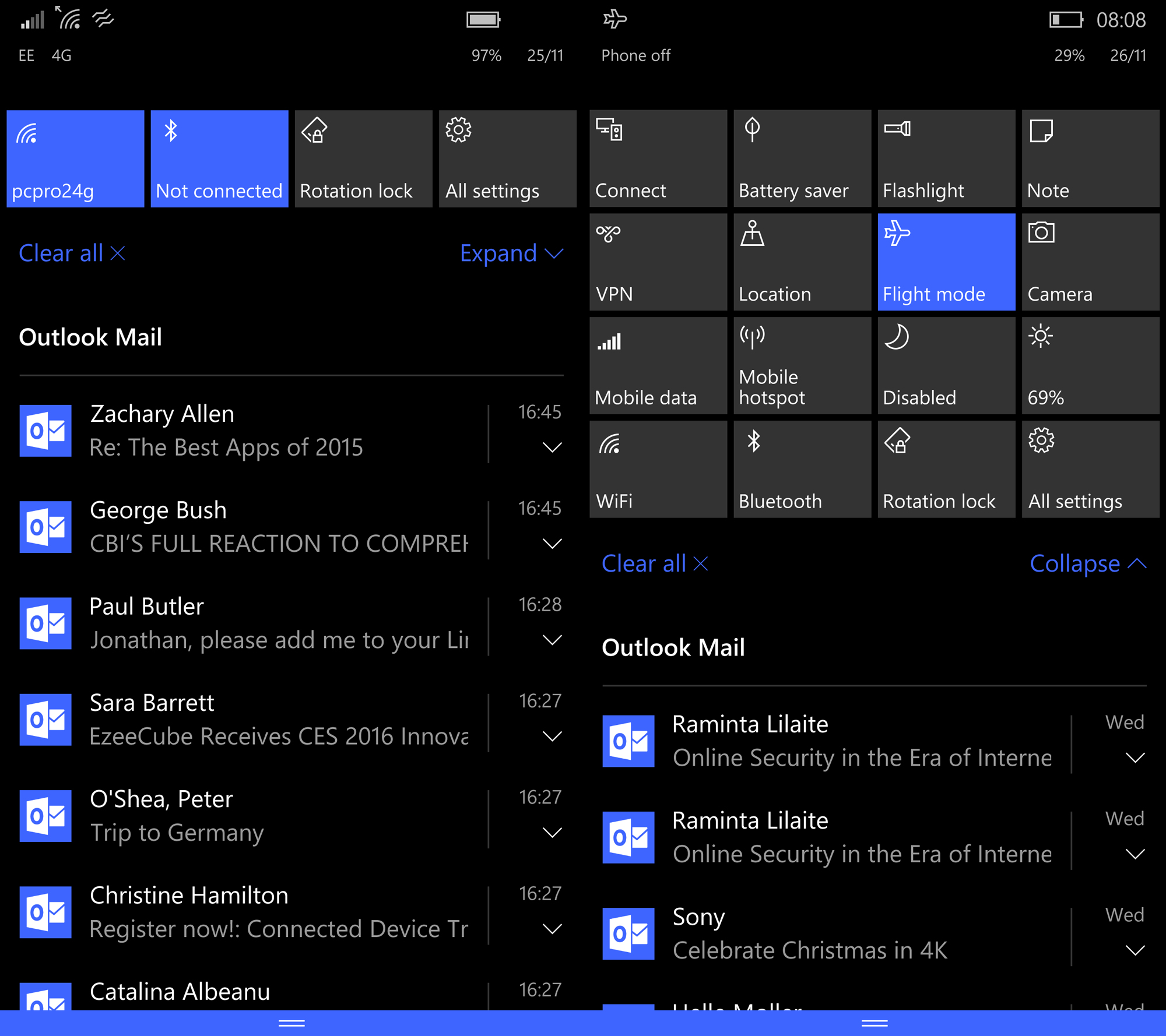
The “All settings” shortcut has disappeared, to be replaced by Expand. Tap this and the single row of shortcut buttons expands to four, allowing quick access to all 16 of Windows 10’s available shortcuts. It’s still possible to customise the four that appear by default, but you can’t currently remove or add items to the expanded list.
Below the shortcut buttons, notifications have also received an upgrade. To the right of each notification now sits a small down arrow, which, when tapped, expands items, allowing you to either read more or even interact with them. Currently, however, the range of apps that hook into this capability is limited: you can respond directly to text messages, but not emails or Slack messages.
Tuck the notifications menu away for a moment, and you may also notice a tweak or two to the look of the homescreen. Background wallpapers, which were previously displayed, rather oddly, through the tiles – as if they were windows onto an image behind – now fill the entire screen behind those tiles for a much more modern look. And some tiles, such as those for Outlook and Microsoft Edge, are now translucent, showing up like squares of frosted glass.
There are some new tile sizes to play around with, too: a huge 4×4 square tile, and a tall thin, 2×4 rectangular tile – although not all apps are compatible with these sizes.
Swipe right to Windows Phone’s alphabetical list of apps, meanwhile, and you’ll see another of the changes, with a list of recently installed apps conveniently displayed in a group at the top of the list for easy access, and a search field permanently displayed at the top.
Windows 10 Mobile review: Unified look and feel
With Microsoft even merging the names of the desktop and mobile operating systems, the aim is to unify the two platforms so there’s consistency across them. That clearly has benefits for users, particularly smartphone newbies, with the familiar look and feel making the transition from desktop to mobile much easier than with other platforms.
But Microsoft’s ambitions reach further and deeper than this. It wants developers to produce “Universal apps” that share the same UI and feature set across the two platforms.
There aren’t many of these third-party apps available just yet, but as you navigate the OS, you’ll pick up hints and echoes of Windows 10 everywhere you look.
There’s the homescreen, which reflects the style of the desktop Start menu. The notifications menu is in the same style, too. More significantly, perhaps, this synchronises with your desktop Windows, so when you dismiss a notification on your phone, it also disappears from your laptop. Neat.

The Settings menu looks identical across desktop and mobile (at least on the surface), with each entry now accompanied by a wireframe icon and fonts that match those used in Windows 10 on the desktop. Again, though, the changes are more than skin deep. Microsoft has also rationalised and organised the list of items in the Settings menu and – at long, long last – added a search field.
As a result, it’s now easier to find important settings and features on your Windows 10 smartphone, although you’ll still be left scratching your head about some of Microsoft’s decisions. Why on earth are the Glance screen settings under Extras, and not Display? For that matter, why are the lockscreen settings under personalisation? It’s baffling to say the least.
The redesign of the core apps is the key indicator of how Windows 10 Mobile is unifying the worlds of desktop and mobile. All of the core apps – from the Office apps to Microsoft Edge browser, Calendar, Mail and so on – share the layout and UI of the equivalent app on Windows 10 for desktop. And, by and large, they all work pretty well. I’m not a big fan of the menu that pops up from the bottom of the screen and replicates the desktop Ribbon interface, but this is no deal breaker.
Cortana also shares the desktop app’s look and feel, as well as its extended functions – such as the ability to send text messages and emails by voice. However, Cortana is infuriatingly inconsistent in its voice recognition accuracy and nowhere near as competent as Google Now.
Windows Phone 10 review: Continuum
Another unique feature of Windows 10 Mobile – and some would say its best – is Continuum. Plug a video adapter into the Lumia 950’s USB Type-C port and you can to hook the phone up to any monitor or TV and use it like a desktop PC.
All you need to add is a Bluetooth keyboard. A mouse isn’t strictly required, since the screen of your the phone transforms into a multitouch trackpad – and a rather effective one at that. However, for the full desktop experience, I’d say it’s advisable to get one.
Alas, I’ve not been able to test the feature out using Microsoft’s £79 Display Dock yet, which is equipped with three USB ports, plus DisplayPort and HDMI video outputs and a USB Type-C port for power supply. Ironically, though, I was able to get it to work with editorial director Ian Betteridge’s Apple USB Type-C to VGA adapter. This works at a rather coarse resolution – you need an HDMI or DisplayPort adapter to run at full 1080p – but, nevertheless, it works well.

It’s also worth noting that Continuum works with Miracast-compatible screens and adapters, although when I tried this out with an official Microsoft dongle, it felt horribly slow and laggy to use. I’d advise sticking with a wired connection if you plan on using the feature regularly.
So what can you do with your phone in Continuum mode? Strangely, not an awful lot. You can’t run full Windows desktop apps on the screen of your monitor, and neither can you run Windows 8.1 apps, although these will run on the screen of the phone while your pseudo-desktop runs on your monitor or TV.
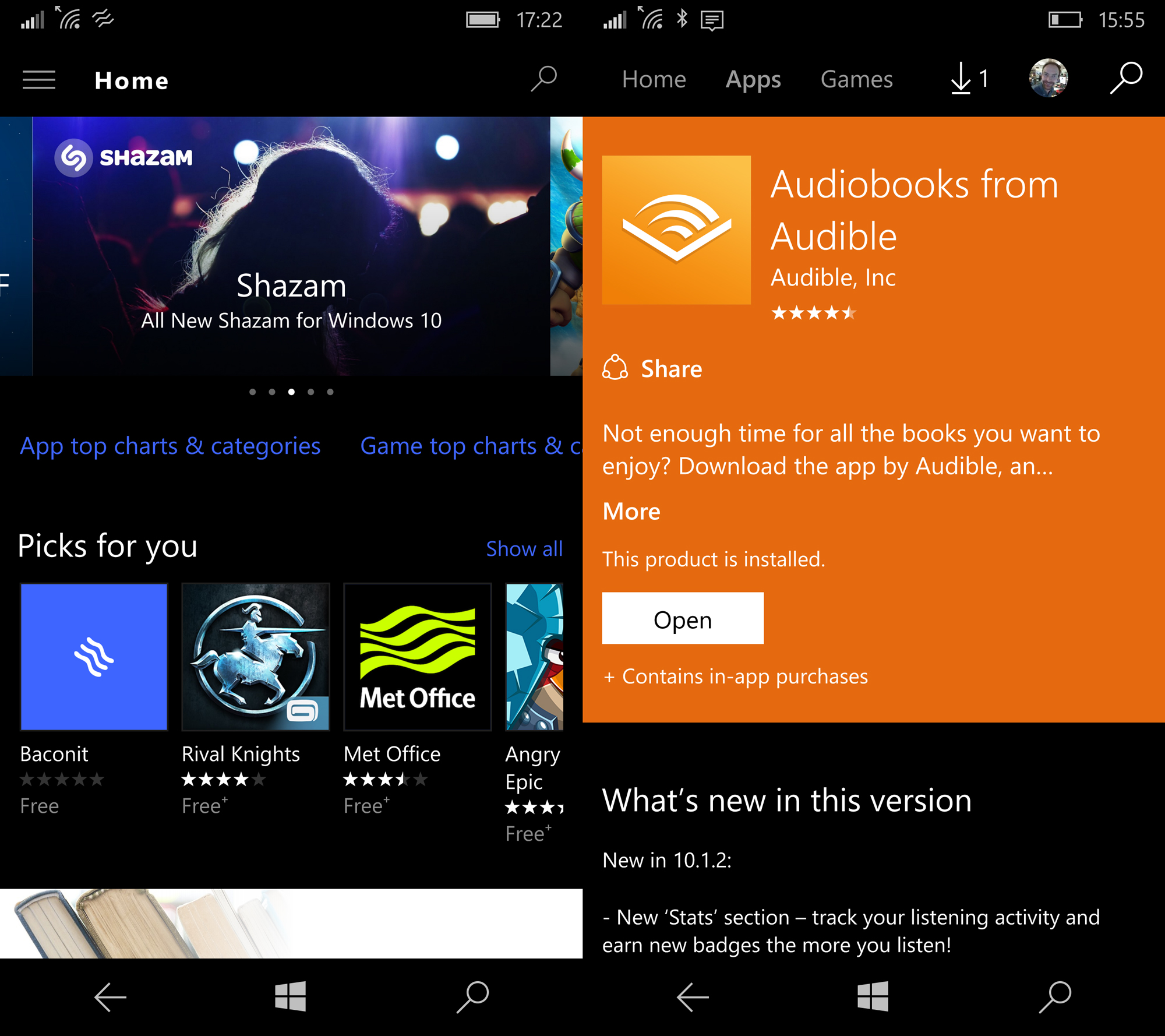
The only apps that work, in fact, are Universal apps, and there aren’t too many of those around right now: just the core Microsoft productivity apps – Mail, Word, Excel and PowerPoint, plus Microsoft Edge, Maps, Films and TV and so on – plus a small handful of third-party apps. The Audible and Guardian apps work, but not a lot else.
However, for the apps that are available, the system does work well. There’s a file explorer app, which lets you browse files in local storage as well as drives that are attached externally via the Display Dock. It’s easy to get to grips with because the desktop is laid out in a familiar fashion to desktop Windows 10, with the Start menu in the bottom-left corner, notifications in the bottom-right corner and taskbar running all along the bottom of the screen. You can’t run apps in windows, though.
Does Continuum mean you’re going to start carrying around just your phone instead of a laptop? I can’t see it just yet. But Microsoft is at least trying to give you the option in certain circumstances.
Windows 10 Mobile review: Apps
This is all great, but no review of a new smartphone OS would be complete without considering apps. It’s the elephant in the room for Windows 10 Mobile. No two ways about it, Microsoft’s mobile platform suffers in comparison with iOS and Android when it comes to apps.
Not, perhaps, for the major social networks, movie and music streaming apps – most of those are present in the Store. When it comes to apps for accessories, however, such as smartwatches, fitness bands and smart home appliances, the Microsoft ecosystem languishes in third place, and a distant third at that.
This may change over time if the concept of Universal apps catches on. After all, there’s still a huge installed base of Windows laptops and PCs out there, and the appeal of being able to develop one app for those and then have it work, just like that, across smartphones could well eventually fill the gap.
That’s very much for the future, though, and if you buy a smartphone running Windows 10 right now, you’re going to be missing out in some areas. And if you think you don’t care about that now, with the Internet of Things rapidly expanding and the smartphone becoming the common interface for smart technology everywhere, rest assured you will do soon.
Windows Phone 10 review: Verdict
I’ve always had a bit of a soft spot for Windows Phone, and despite its foibles, that fondness continues with Windows 10 Mobile. I like the simplicity of its interface and what Microsoft has done in extending the look and feel across both desktop and mobile here is a remarkable feat of UI design. Sure, there are some areas it doesn’t quite work, but largely Microsoft has pulled it off, and that should be applauded.
“For Windows Phone fans everwhere, and those encouraged by Microsoft’s ambitious new direction, there’s just enough here to encourage them to hang on for one more generation.”
The question is: are the changes enough? Will they be enough to encourage dyed in the wool iOS and Android fans to make the switch? The answer to those questions is absolutely not. Windows 10 Mobile is too far behind and has too little market share to turn that around any time soon.
However, for Windows 10 and Windows Phone 8.1 fans everwhere, and those encouraged by Microsoft’s ambitious new direction, there’s just enough here to encourage them to hang on for one more generation. And, who knows, after another two years, the picture may look even rosier.
See also: The best smartphones of 2015/2016 – your ultimate guide.
Disclaimer: Some pages on this site may include an affiliate link. This does not effect our editorial in any way.