What do women’s pockets, stargazing, and Cardcaptor Sakura all have in common? Not much, other than the fact that they’re the focuses of three of the hundreds of submissions from this year’s Information is Beautiful Awards.
The Information is Beautiful Awards (or IBA, as I’ve taken to shortening it,) is an annual competition designed to promote and celebrate the art of data visualisation. Each year, hundreds of students, media brands, and studios submit their projects for judging, and the results are always spectacular and varied. Data visualisations turn numbers into art, using graphs, charts, and other innovative techniques to make statistics accessible. When done properly, they can be, well, beautiful.
If you want to kill a few hours, scroll through the list of previous winners. I promise you, not only will it be one of the more fun things you do today, you’ll also walk away with a few new statistics to toss around the next time there’s a weird lull in a conversation.
This whole thing started in 2012 as a way to showcase data visualisations in science and technology, but of course, the medium doesn’t limit itself solely to a particular field. That’s why the IBA has such wide variety in their submissions. This year’s shortlist has covered everything from Shakespeare to the Thai cave rescue.
Tobias Slater, editorial director for the IBA, told me that this is part of the beauty of the awards. While data visualisation does tend to lend itself toward politics and science, he believes that it’s also a great way for people to explore their passions, whatever they may be. “You know, people are inspired by the things that they find interesting,” he said, during our chat. “It’s always great when someone asks a question.”
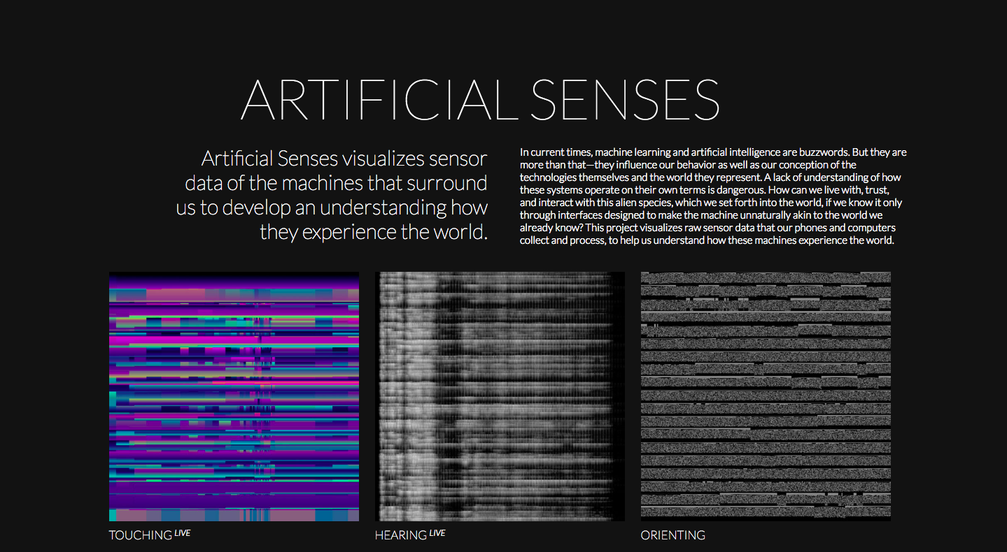
And that’s the key to a lot of these visualisations: Asking a question. It’s what brought Kim Albrecht’s project Artificial Senses into the world. This interactive visualisation of how devices “see” the world was inspired by Kim’s “uneasy feeling” of not really knowing what our technological devices are. “I always have my mobile phone with me but have no clue how it is sensing the world,” he told me. “The project satisfies my own curiosity.” Artificial Senses is the first part of a series called “Images of Operation.”
The IBA is judged both by a panel and a public vote. This year, it has the largest voting panel so far, split half and half between data and topic experts. “We’ve had in the past the high tens of thousands of votes from our users,” said Slater. “We give those people a virtual sort of seat on the judging panel.”
The judges are looking for visualisations that combine a number of achievements. First and foremost, the data needs to tell a story. The purpose of the medium is to present information in a way that captivates and educates, and, as a result, the winning entries are the ones that use the visualisation aspect to amplify the data without being a distraction.
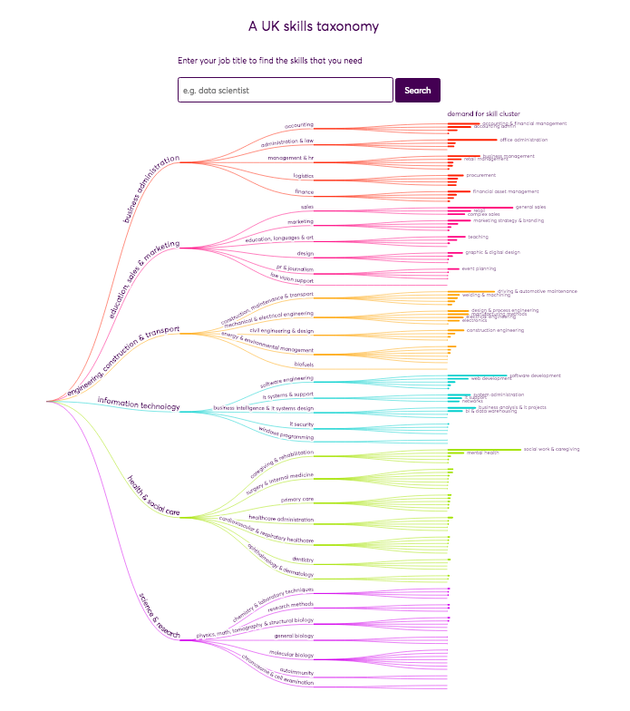
This can be a very difficult undertaking, but for some creators, the difficulty is part of the appeal. One such person is Dr. Cath Sleeman, Quantitative Research Fellow at Nesta and a co-creator of Making Sense of Skills. “I love the challenge of designing a new data visualisation,” she said. “As a data vis creator you only have a fixed number of tools to work with, like colour, length and area. The challenge is using those tools to show data-driven insights in a clear and memorable way.” Making Sense of Skills analyses and categorises the skills that we need to do our jobs, based on over 40 million adverts.
Nominations and voting have closed from this year, but awards are open to all sorts of mediums, not just your typical charts and graphs. Animations, maps, interactives, and even sculptures are allowed, as long as the submission is visual and data-based. While there is a submission fee for most applicants, students and members of the general public who haven’t had their work published before can submit for free. This policy has been in place since the beginning, as a way to platform up-and-coming creators. And since the prize money is provided by Kantar, the IBA’s sponsor, the fees can stay low. Small companies of 1-3 people need only pay $50 (£38.54) per entry, media outlets and NGOs pay $100 (£77.09), and large agencies, brands, and companies pay $200 (£154.19).
The prize money isn’t the only thing the entrants are striving for, however. Winners of the IBA go on to receive huge recognition for their work, often including books deals, art exhibitions, and job offers. That’s because data visualisations are such an important means of communicating information, especially in the news. It can be difficult to imagine the path of a hurricane, but an interactive map can make it comprehensible. Visualisations also make it easier to convey large numbers. I know that the Big Bang happened billions and billions of years ago, for example, but the scope of that number didn’t hit me until I scrolled through this timeline of literally all of history.
(Seriously, check that last one out. It’s one of the coolest things I’ve ever seen.)
Histography from Matan Stauber on Vimeo.
Even if numbers “aren’t your thing,” the point of a visualisation is to make information accessible, and you might be surprised by what you find if you just scroll through the showcase. This year’s submission pool nudged into the thousands – the largest yet – and was whittled down to 100 in the shortlist. Public voting may be closed, but you can keep track of the awards in their news section, and for the diehard datavis fans, you can even attend the awards ceremony in New York on 4 December, and be there in person when the winners are announced – your own way of seeing data created in real time.
Photo: Kantar Information is Beautiful Awards
Disclaimer: Some pages on this site may include an affiliate link. This does not effect our editorial in any way.