The above map from the Oxford Internet Institute gives an interesting insight into the current spread of internet access around the world.
Each hexagon represents 470,000 people connected to the internet. The shades show the overall percentage of the population connected, with dark red indicating that 80-100% of the country’s people enjoy some form of internet access.
If the country is shaded white, this means less than 20% of the population is connected. In other words, the lighter the shading, the more scope the country has to grow. India is reasonably sized, but if more of its population were online, it would swell to take up a huge portion of this hexagonal world.
It provides an interesting insight into different populations and the global makeup of the web in any case – the UK and Japan make Australia look tiny, and Russia has undergone a massive weight-loss programme, shrinking to roughly the size of France.
This isn’t the first time worldwide internet use has inspired cartographers…
Digital inequality across Britain
First up, the map below looks at digital inequality across Britain, again from the Oxford Internet Institute.
Internet speeds around the world
If you live in rural Wales or the North East and feel sorry for yourself, then cheer yourself with this: at least you have it better than the majority of the world. Here’s a map showing internet speeds around the world. 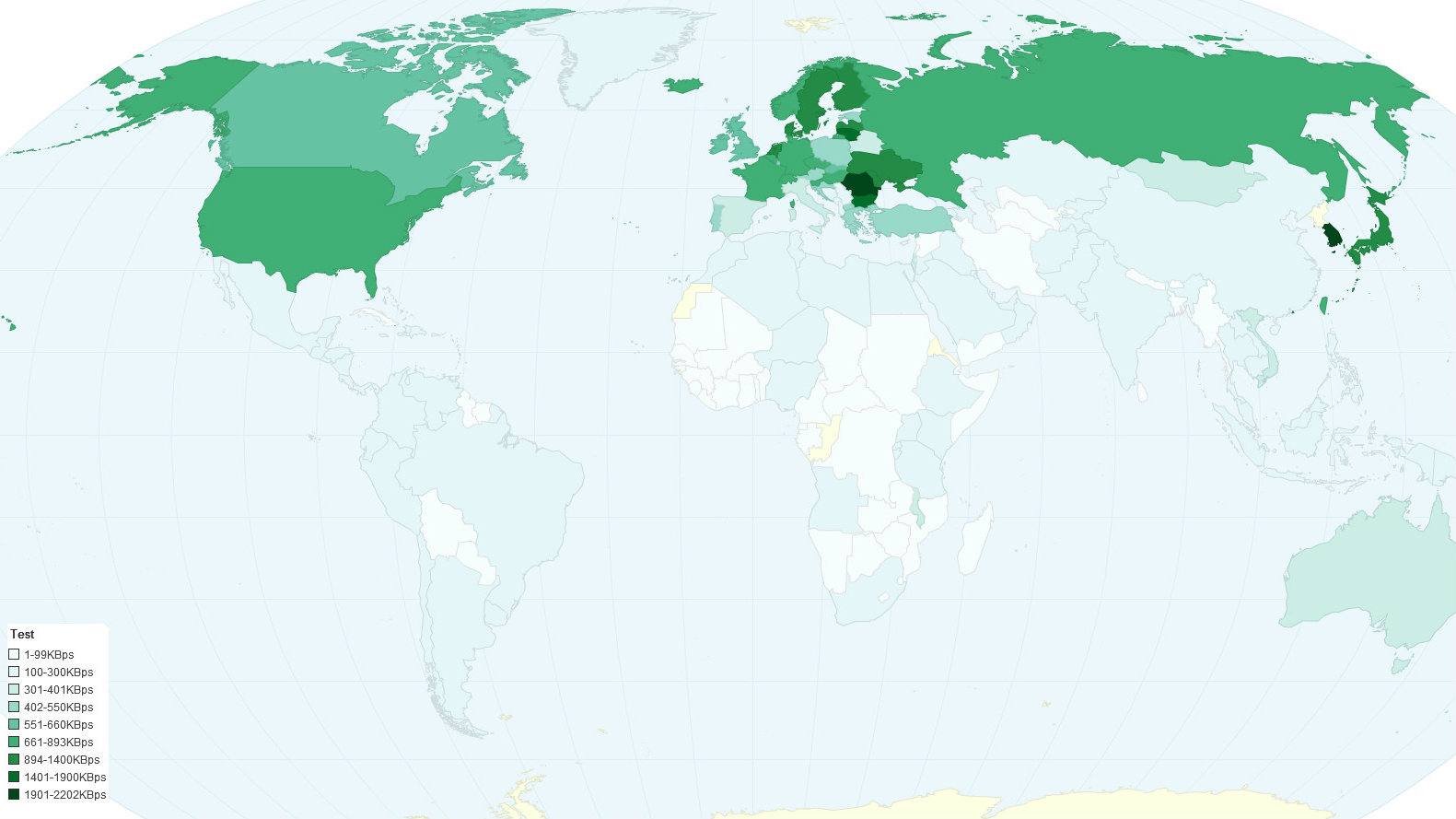
Top web browsers by country
But how do they access it? The map below provides some answers, showing the most popular web browser by country. Google’s journey to world domination continues unabated… if Japan can be weaned off Internet Explorer.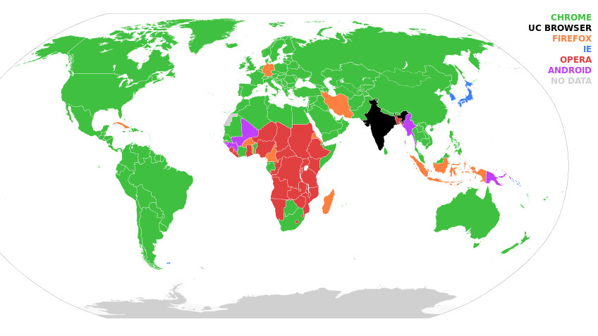
Map of the anonymous internet
Meanwhile, another map from the Oxford Internet Institute not only illustrates their love of the hexagon, but also which countries value their privacy, with a look at the global Tor usage by country.
Internet censorship by nation
It’s actually surprising how little that map tallies with this one: the amount of internet censorship by country.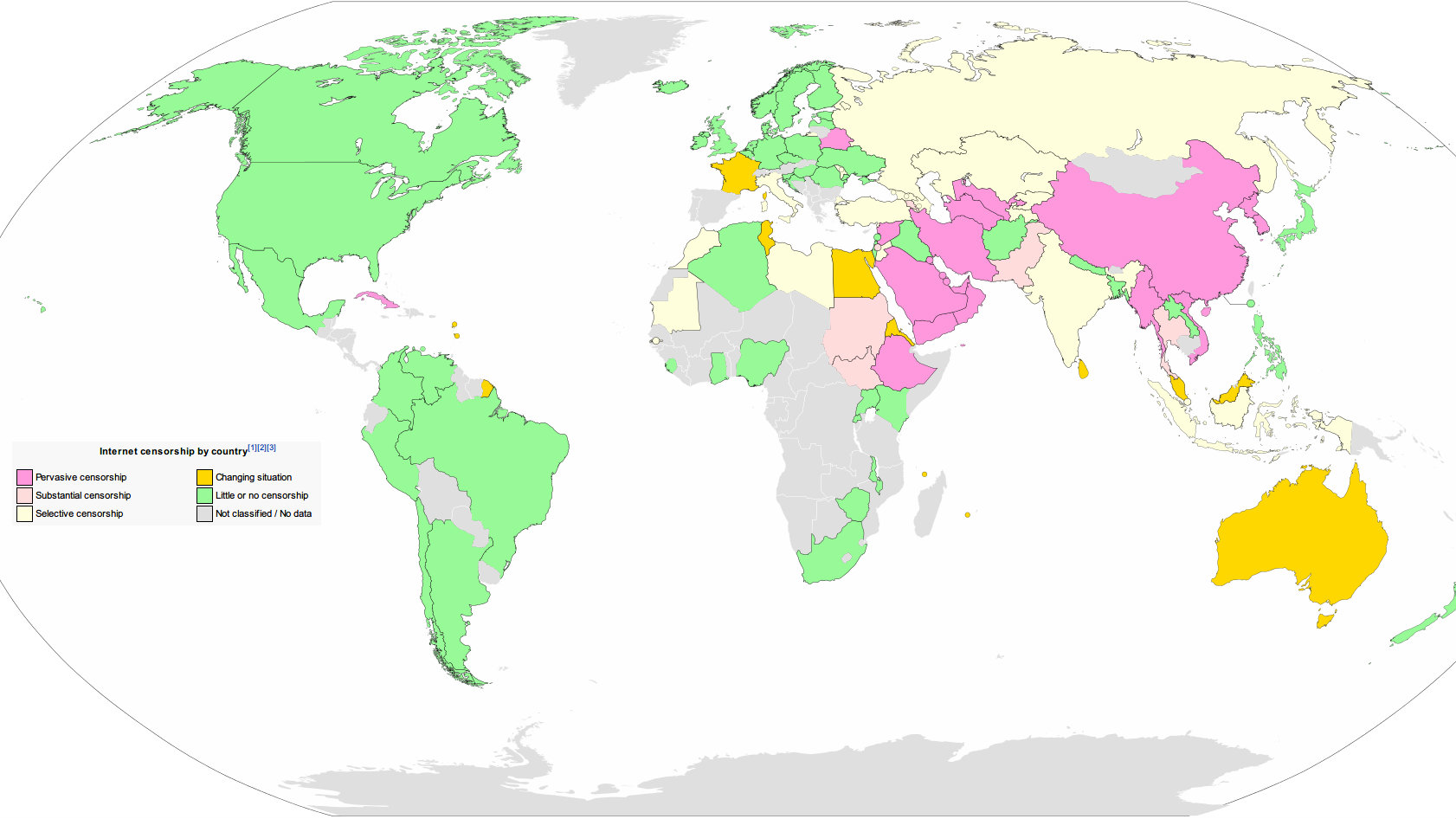
Map of the internet, December 1969
But hey, no matter how censored your content is, it could always be worse. Remember what the internet was in December 1969?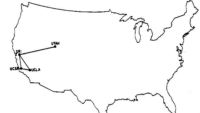
Here be dragons: the map of the internet
Whereas now, we’ve got a huge number of people designing and populating a massive number of websites. One of those many jobs? Mapping out the internet in creative ways. Like this:
Disclaimer: Some pages on this site may include an affiliate link. This does not effect our editorial in any way.