One of the most important features of the R programming language is the X and Y-axis scales. They determine the look of your grid lines, labels, and ticks, making them crucial for any project. Default scales often don’t do the trick, which is where changing these metrics comes into play.
In this guide, we’ll explain how to change the X and Y axis scales in R. You’ll also find out how to create custom axes and other useful details.
How Do You Change the X and Y Axis Scale?
There are several ways to change the X and Y axis scale in base R. Most people rely on the ylim() and xlim() functions. The following example shows how they work:
#define data
df<- data.frame (x=c(1, 1, 3, 3, 4, 6, 8, 12, 13, 15, 18, 21, 22),
y=c(13, 15, 9, 17, 22, 25, 29, 35, 39, 44, 45, 40))
You can use this to create a plot with the default axis scale:
plot(df$x, df$y, pch=19, main='Default Axes')

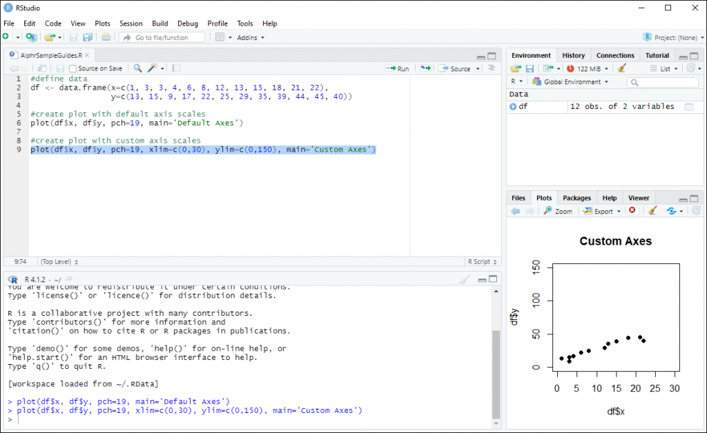
Creating plots with a custom scale is also an option:
plot(df$x, df$y, pch=19, xlim=c(0,30), ylim=c(0,150), main='Custom Axes')
How to Use the Log Function to Change the X and Y Axis Scale?
The log function can also come in handy. It enables you to transform your axes to log scales. Take a look at the next code to see the log function in practice:
df <- data.frame(x=c(1, 3, 3, 4, 6, 8, 12, 13, 15, 18, 21, 22),
y=c(13, 15, 9, 17, 22, 25, 29, 35, 39, 44, 45, 40))
This defines the necessary data, allowing you to create your plot with log y-axis:
plot(df$x, df$y, log='y', pch=19)

How to Change the Axis Scale in ggplot2
Knowing how to change the axis scale is beneficial in various settings, such as plots in your base R. Again, you can utilize the ylim() and xlim() functions to alter the scales, as shown by the following code:
library(ggplot2)
df <- data.frame(x=c(1, 3, 3, 4, 6, 8, 12, 13, 15, 18, 21, 22),
y=c(13, 15, 9, 17, 22, 25, 29, 35, 39, 44, 45, 40))
Creating a scatterplot with custom axes shouldn’t be too hard, either:
ggplot(data=df, aes(x=x, y=y)) +
geom_point() +
xlim(0, 30) +
ylim(0, 150)
Another option is to transform the axes to log scales with these arguments:
- scale_x_continuous(trans=’log10′)
- scale_y_continuous(trans=’log10’)
Here’s an example of these arguments in code:
library(ggplot2)
df <- data.frame(x=c(1, 3, 3, 4, 6, 8, 12, 13, 15, 18, 21, 22),
y=c(13, 15, 9, 17, 22, 25, 29, 35, 39, 44, 45, 40))
This information lets you make a scatterplot with a custom log y-axis:
ggplot(data=df, aes(x=x, y=y)) +
geom_point() +
scale_y_continuous(trans='log10')
How to Create a Custom Axis in R
Besides modifying the X and Y axis scale, R also enables you to create your own axes. Naturally, you’ll need to use the axis function. This is what the most common template looks like:
axis (side, at=, labels=, pos=, lty=, col=, las=, tck=, …)
Here’s what each component inside the parentheses means:
- side – the side of your graph where the axis will be drawn (4 – right; 3 – top; 2 – left; 1 – bottom)
- at – a vector that indicates where the tick marks will be positioned
- labels – a label vectors that will be placed at your tic marks (if it’s zero, the program will use the at value)
- pos – this is the coordinate for drawing your axis line (i.e., the value where it crosses the other axis)
- lty – the type of line
- col – the color of the tick mark and line
- las – this specifies whether the labels are perpendicular (=2) or parallel (=0) to the axis
- tck – the length of your tick mark represented as a fraction of the plotting region. Negative values are outside the graph, whereas positive numbers are positioned inside. In addition, zero suppresses the ticks while 1 creates the gridlines (-0.01 is the default value).
When creating custom axes, you may want to consider suppressing the axes automatically generated by the high-level plotting function. Here’s how:
- Type in “
axes=FALSE” to suppress both axes at once. - Type in “
xaxt="n"” to suppress the X axis. - Type in “
yaxt="n"” to suppress the Y axis
How to Change the X and Y Axis With the Scale Functions?
Yet another way to alter your axes is to employ the scale_xx() function. Take a look at the simplified format of this feature:
scale_x_continuous (name, breaks, labels, limits, trans)
scale_y_continuous (name, breaks, labels, limits, trans)
The meaning of these elements goes as follows:
- name – Y or X axis label
- breaks – controlling the breaks in your guide (e.g., grid lines and axis ticks). Some of the most common values include null, waiver, and character or numeric vectors that specify the breaks.
- labels – labels of your axis tick marks. The allowed values include null, waiver, and character vectors.
- limits – this numeric vector determines the limits of the X or Y axis.
- trans – most users go for log2 or log10 as their trans value. As the name suggests, it’s used for axis transformation.
Put Your R Coding Skills to the Test
Modifying the scale of your X and Y-axis opens up new possibilities in R. It allows you to present your data clearly with appropriate labels, tick marks, and other essential elements. Best of all, you shouldn’t have too much trouble changing the scale since most of the process is relatively straightforward.
Do you prefer default or custom axes in R? How often do you change your axes? Have you ever created a custom axis? Let us know in the comments section below.
Disclaimer: Some pages on this site may include an affiliate link. This does not effect our editorial in any way.