While the year 2100 might feel like light years away, it will be a reality for a fraction of the global population. For those of us who will be dead and gone, Climate Central doesn’t want us to miss out on the devastation predicted as a result of global warming.
The organisation has released an interactive map called Shifting Cities that charts how hot a number of given cities will be if we continue on our current trajectory of carbon emissions, and the results – you guessed it – are troublesome.
Instead of just lobbing a random figure at you, Shifting Cities will align your chosen city’s predicted temperature with that of another city’s current temperature. London’s average summer temperature, for example, currently stands at 20.4 degrees. Fast forward to 2100, and that temperature soars to 25.2 degrees, Milan’s current average.
And while five degrees sounds almost negligible, the reality is far from it. In fact, a two-degree temperature increase by the next century is considered the “tipping point” in global warming, signalling a downward spiral – impacts include flooding, drought, extreme weather and sea level rise.
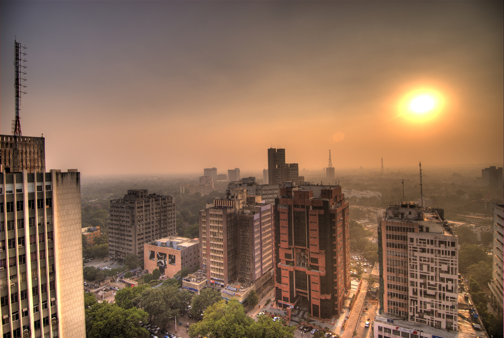
Play around with Shifting Cities further and things get interesting. Delhi’s current summer average is an intolerably high 35.2 degrees, but Climate Central predicts that by 2100 it’ll have reached 40.2 degrees, as hot as Sharjah’s summer average in the United Arab Emirates.
Explore a little more around the Middle East, and more often than not you’re met with an ominous red screen informing you of the predicted temperature for 2100 in each corresponding city, as: “Currently, no place on Earth is this hot.” Riyadh, for example, in Saudi Arabia, is expected to reach an average summer temperature of 48 degrees. Uninhabitable.
It’s not just mindless scaremongering, though. The map comes as part of Climate Central’s drive to combat climate change by educating people about its very drastic ramifications. They’ve also created a Climate Impact Map, giving you a view of temperature predictions for the years 2020-2039, 2040-2059 and 2080-2100. There’s even a ‘change from historical’ setting where you can view the temperature change from 1986 to 2005 using global averages.
These maps come hot on the heels of a spate of recent initiatives designed as a wake-up call for climate change. A recent University of Washington study showed that the odds of us limiting climate change to under two degrees by 2100 are 5%. What’s more, the odds of us keeping global warming at under 1.5 degrees by the time we reach the next century – this was a stipulation in the 2016 Paris Agreement – is a pitiable 1%. These maps are illuminating, but they should also be alarming. It’s high time we buck our ideas up: posterity depends on it.
Disclaimer: Some pages on this site may include an affiliate link. This does not effect our editorial in any way.