Sometimes, delivery drivers can’t find the road I live on. In 2018: a year where everyone has some kind of mapping device right there, in their pocket.
To be fair, my address has shifted over the years, and I don’t mean via multiple flat and house moves – I mean the physical ground as the continents shifting over millenia. In the impossibly unlikely scenario that a smart aleck delivery drivers tries to use that an excuse for not delivering something, I now have the perfect response: an interactive map which shows where you would have lived anywhere between 20 million and 750 million years ago.
Naturally, it’s an approximation for obvious reasons, but it’s still very interesting. By default, the map is set to 240 million years ago – or the early Triassic period when your most likely neighbours would be some early dinosaurs. The good news, in this entirely hypothetical scenario, is that you would be able to up sticks easily, given almost all of the world was a single block of land: the Pangea continent.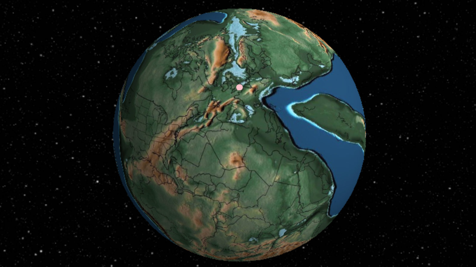
You might struggle to see where you are on the map, but to make things a little easier, the creator of the project, Ian Webster, has overlaid current approximate land borders over the top, so you can see how it will break apart in the millenia to come. From there, use the left and right cursor to scroll back and forward through Earth’s history. Humans only feature in one of the 26 dates visible, given we’ve only been around for 200,000 or so years: a footnote in historical terms, but punching above our weight in terms of trashing our planetary tenancy agreement.
If you’re curious as to how Webster made the map, he explains over at Hacker News. In short, he adapted GPlates which is a project that helps geologists investigate tectonic data. He says the project has led to “emails from angry geologists” because of the interpretation he’s ended up using, but ultimately he decided this was the right way to go. “It would certainly be more accurate to show a simple plate diagram rather than an artistic version of the Earth, and it would make my life easier too because then I could show continuous plate movement for each year,” he wrote. “But there is a certain thrill in seeing ancient earth all globe-like, so I stand by my choice to use these rasters.
“I’m amazed that geologists collected enough data to actually plot my home 750M years ago, so I thought you all would enjoy it too,” he explained. You thought correct, Ian.
Disclaimer: Some pages on this site may include an affiliate link. This does not effect our editorial in any way.