A simple and intuitive navigation menu is one of the most essential design elements on your website. It acts like a map, guiding your visitors beyond the homepage. With the increasing number of people using the internet on their mobile devices, your website should also have a mobile-friendly navigation menu.
Luckily, Webflow has made it easy to add a collapsible hamburger menu bar that will streamline your mobile site. Keep reading to learn how to edit this mobile menu on Webflow.
How to Add a Navigation Bar
The hamburger menu is a vital design element when working with limited horizontal space. It eliminates the need for a bulky fixed navigation bar that takes up valuable space.
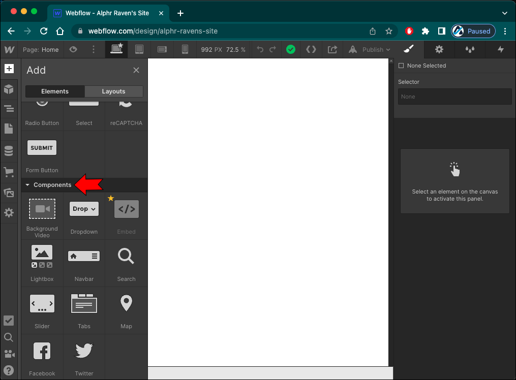
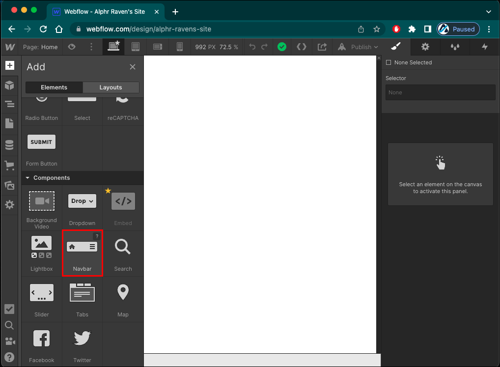
On Webflow, this menu and its functionalities are built inside the NavBar element. Adding this element to your design requires four simple steps:
- Tap the “+” icon at the top of the left panel to open the “Add” panel.
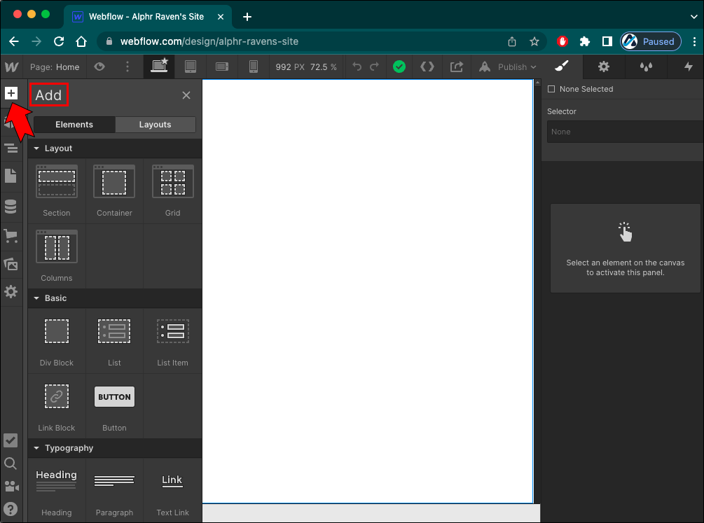
- Scroll down to the “Components” section.

- Click and hold the “NavBar” element.
- Drag the element to the page’s header.
How to Edit the Mobile Menu
Once you’ve added a navigation bar to your website, there are several different ways you can add style and personality to this menu.
How to Add More Links to the Menu
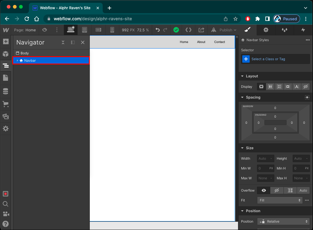
The navigation bar element contains the menu button and the navigation menu, with the latter holding the navigation links. When you add it to your design, there will be several link placeholders that you can delete or edit with your website links.
Follow these steps to add more navigation links:
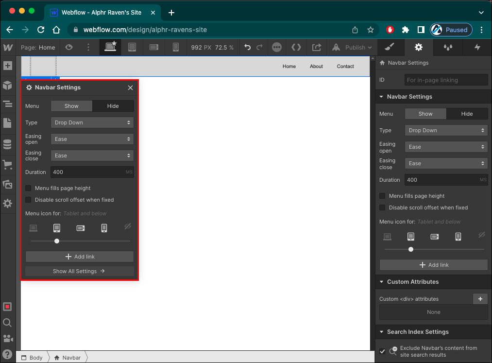
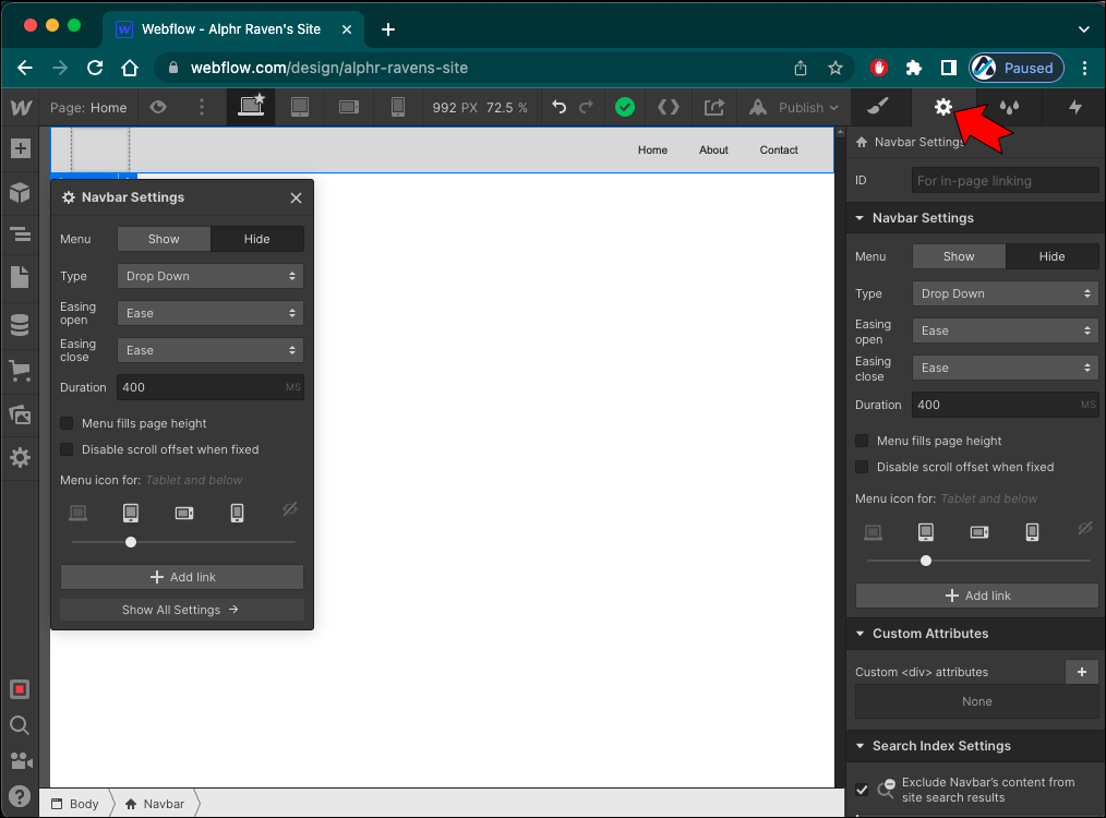
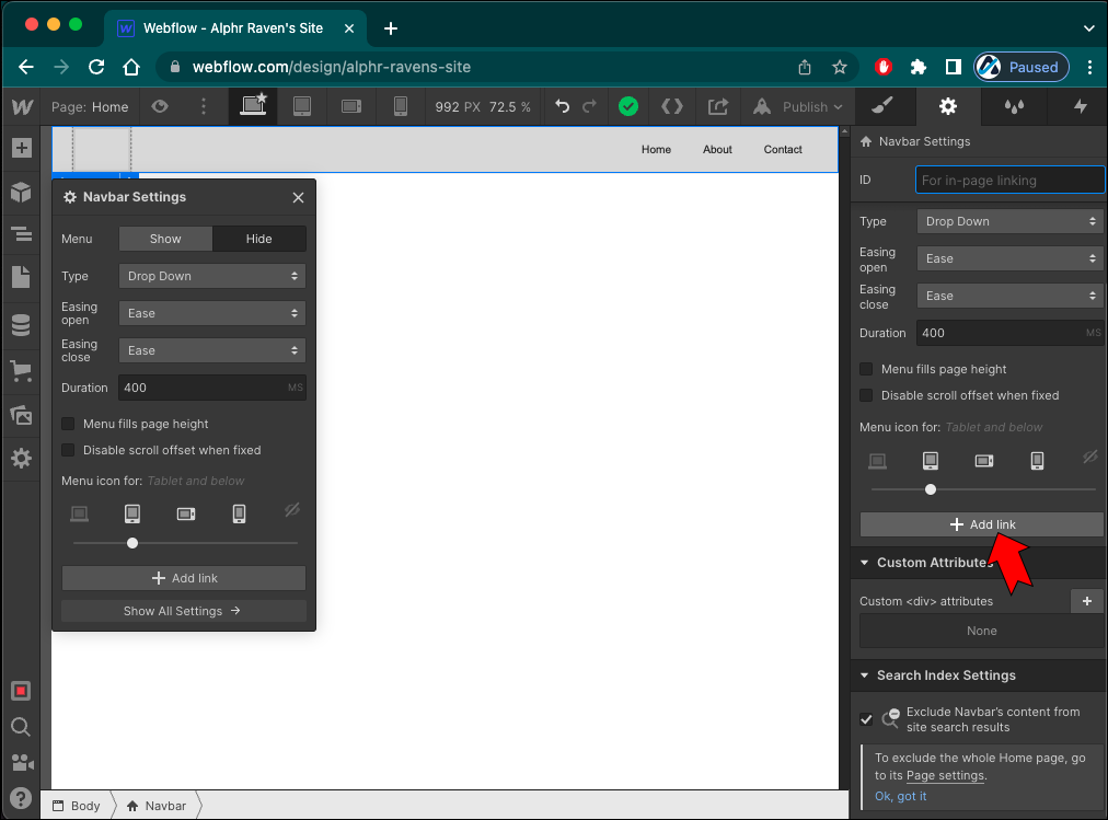
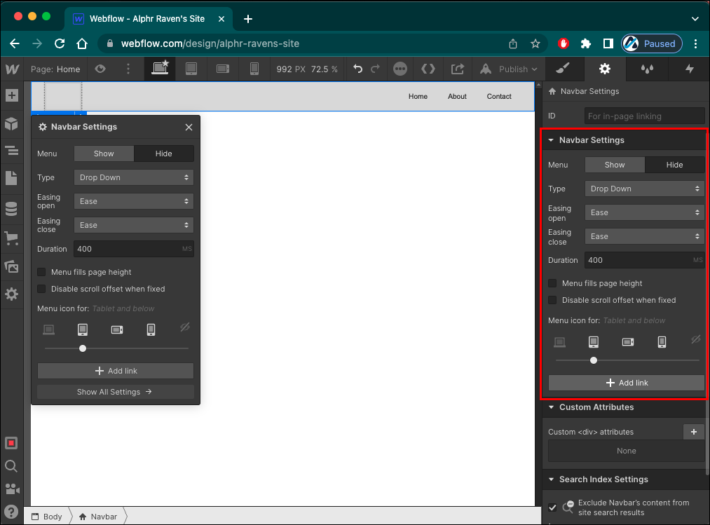
- Click on any element inside the NavBar.
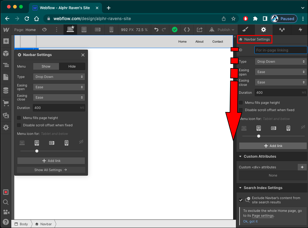
- Head to the “Elements Settings” panel on the right.
- Press the gear icon to open the “Settings.”
- Scroll to the “NavBar Settings” section.
- Tap the “Add Link” button.
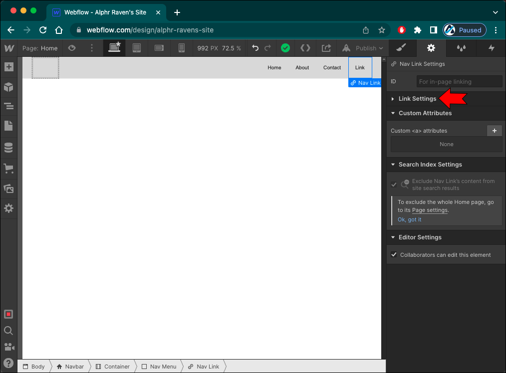
Now that you have a sufficient number of links for all your relevant website pages, it’s time to do the actual linking.
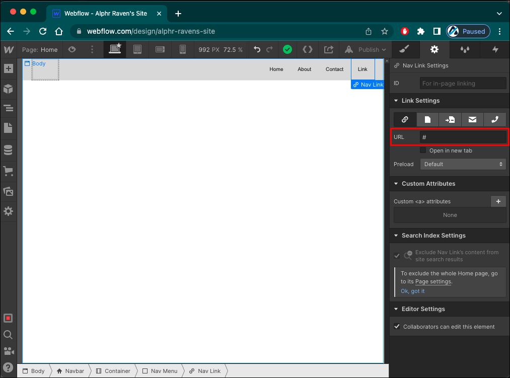
- Select a navigation link.
- Go to the “Elements Settings” panel.
- Locate the “Link Settings” section.
- Enter the designated webpage URL into the “URL” field.
How to Change Menu Animation
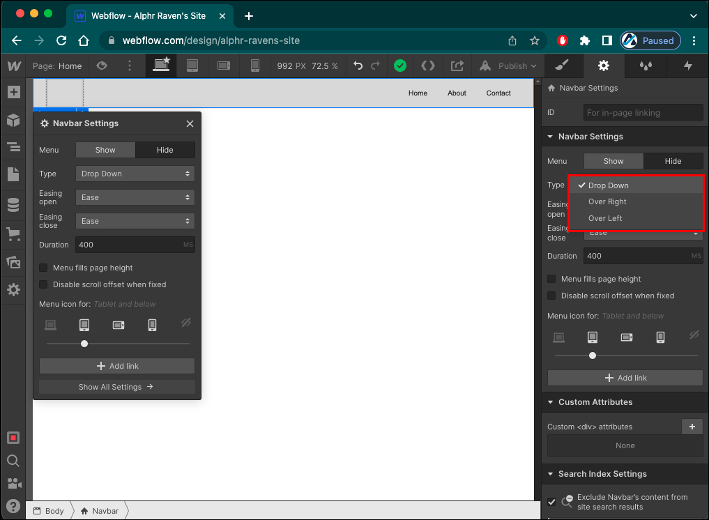
On Webflow, you can also change how the mobile menu appears when visitors click the menu button. You can choose between three types of these reveal animations:
- Drop Down – By default, the mobile menu will drop down from the NavBar once the visitor taps the menu button. It will take up the browser window’s width in its entirety.
- Over Right – If you select this reveal animation, your mobile menu will appear from the right side of the screen. This menu will take up the entire browser window’s height.
- Over Left – This menu type is identical to the Over Right, except the navigation menu will move from the left side of your screen.
To set your desired reveal animation, do the following:
- Select any element inside the NavBar.
- Go to the “Elements Settings” panel on the right side of your screen.
- Tap the gear icon to launch “Settings.”
- Navigate to the “NavBar Settings” section.
- Click on the “Type” option.
- Select the preferred style from the drop-down menu.

In the “NavBar Settings” section, you can also control the following:
- Easing open: the curve type used to animate the open transition.
- Easing close: the curve type used to animate the close transition.
- Duration: how long it takes for the menu to appear.
Note that the transition duration is measured in milliseconds.
How to Change Menu Styling
Webflow made it easy to style any part of the navigation bar, allowing you to seamlessly fit the mobile menu into your website design.
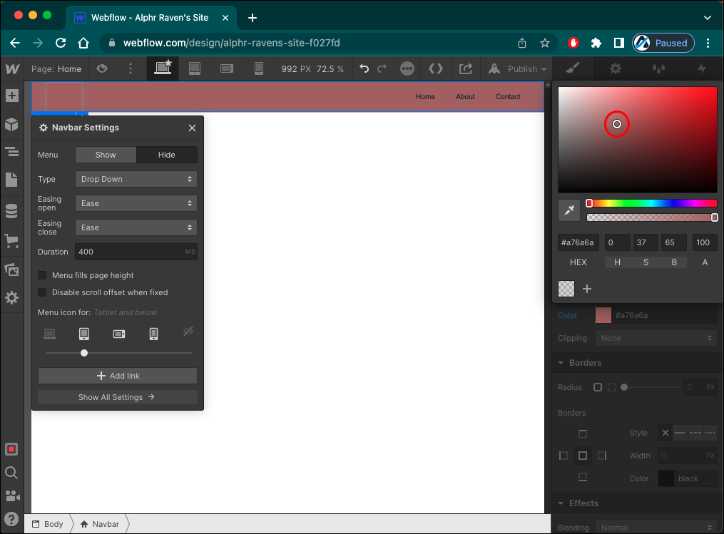
To style the menu button, do the following:
- Select the menu button.
- Go to the “Style” panel on the right (the brush icon).
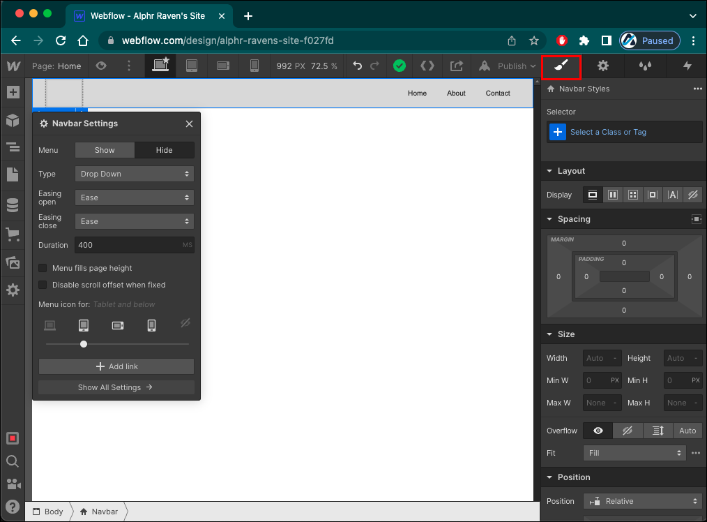
The Style panel allows you to change every aspect of the menu button. Most commonly, designers change the button’s background color and size.
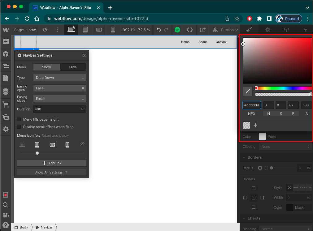
To change the background color, do the following:
- Go to the “Backgrounds” section.
- Tap the color drop icon to open the “Color Picker.”
- Select the desired color.

If you’d like to change the size of the hamburger icon, follow these steps:
- Navigate to the “Typography” section.
- Increase or decrease the icon size in the “Aa” field.
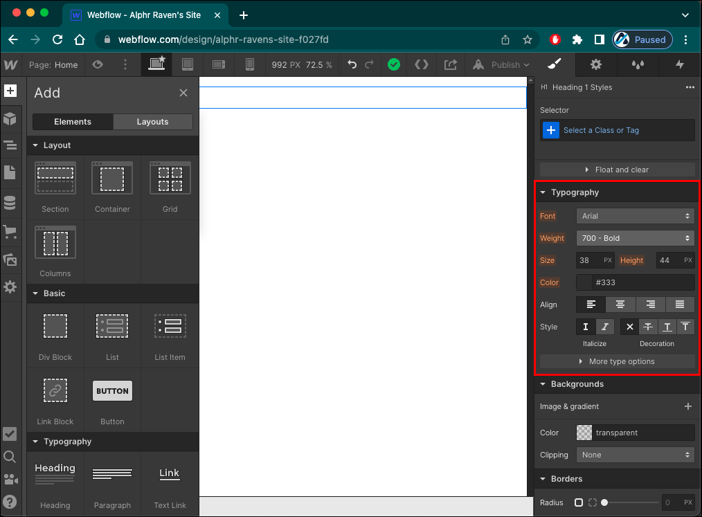

You can also change the icon’s color in the field above, marked by the letter A and a color drop.
While there are many ways to customize the menu button, you can’t replace it with a text element or a custom image.
Mobile Navigation Made Easy
When designing a mobile menu, you want to get the most out of fairly limited space. So, try not to overflow the menu with options to avoid confusing your visitors. Also, ensure the menu choices are short, clear, and easily readable.
After that, you can play with the menu styling and animation to keep your visitors interested every step of the way.
Have you tried adding a mobile menu to your website? How many options did you include? Let us know in the comments section below.
Disclaimer: Some pages on this site may include an affiliate link. This does not effect our editorial in any way.